
Cynthia Connolly |
Musicians from DC and their Cars ( later renamed favourite mode of transport) is a black and white set by Cynthia Connolly featuring musicians in relation to their cars meant to accompany a set by Pat Graham entitled Photos of some of the same People Live! in their Band.
Taken from multiple angles this set allows for a comparison between musician's clothing as well as styles and their car of choice. With the majority of the participants staring directly at the camera in close proximity to their cars and a wide angle lens being used in some shots an intense almost possessive relationship is suggested between themselves and the object. |
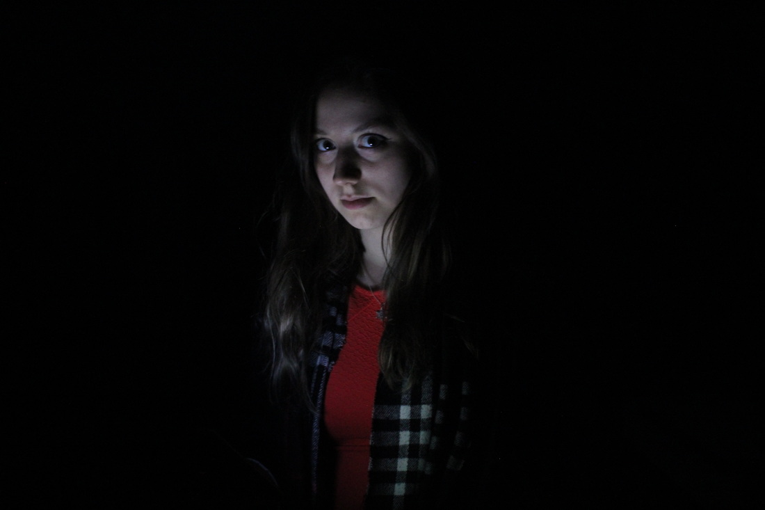
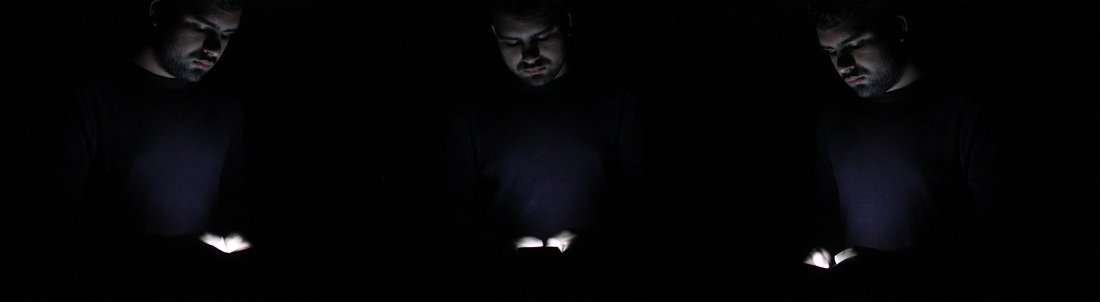
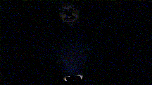
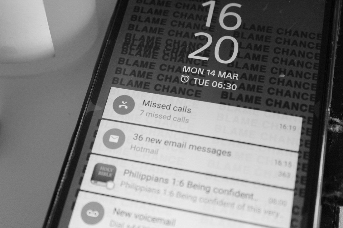
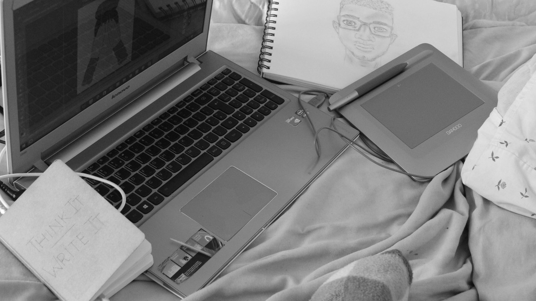
In response to this set I debated with photographing people with everyday items of significant value to the subject or people on their phones from over the shoulder shots in a typological fashion. But I finally decided upon aiming to present the opposing dominating relationship items such as phones tend to have over us, through photographing several people in a dark room on their phones I was able to capture the light of their phones illuminating their faces. This allowed for a dreamlike ethereal appearance which seemed to suggest that their phones were drawing them into another world.
|
|
Despite originally planning to have my subject only remain on their lock screens (in order to achieve a variance in colour of light shinning on each face) I quickly found during my test shots that I preferred a whiter light as I felt it reinforced my desired idea of the phones having a possessive feel over the subject. |
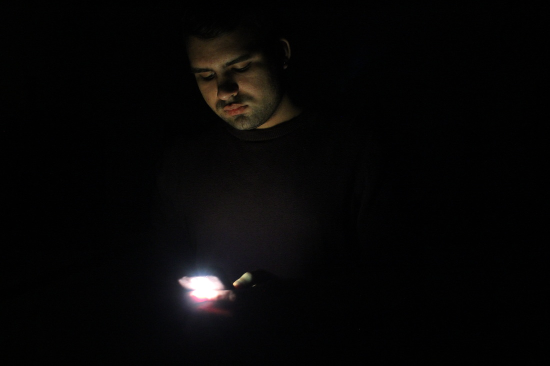
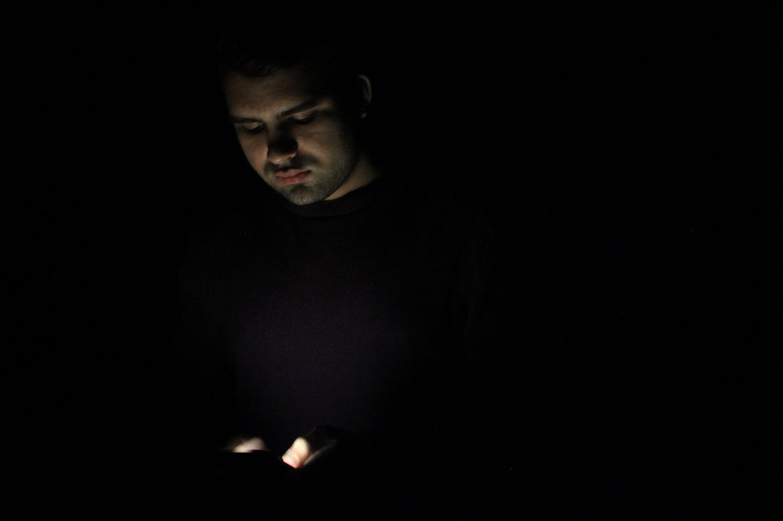
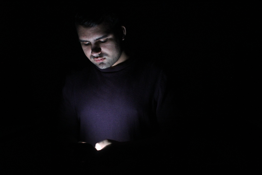
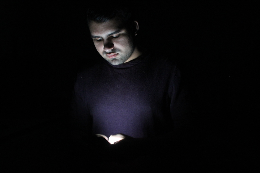
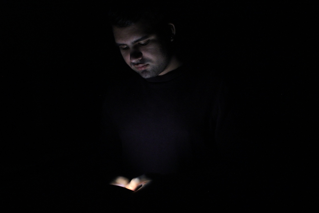
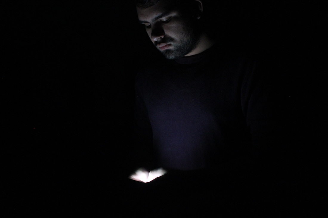
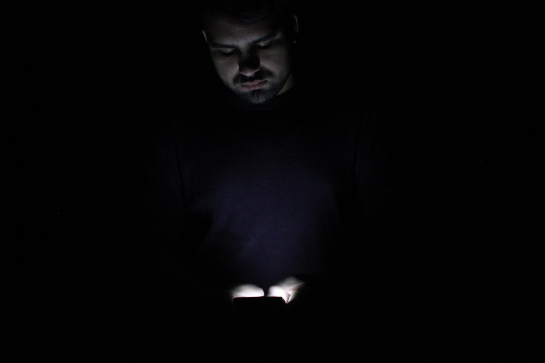
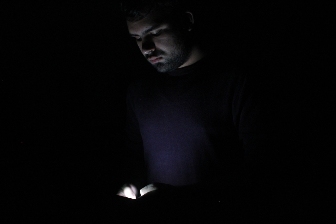
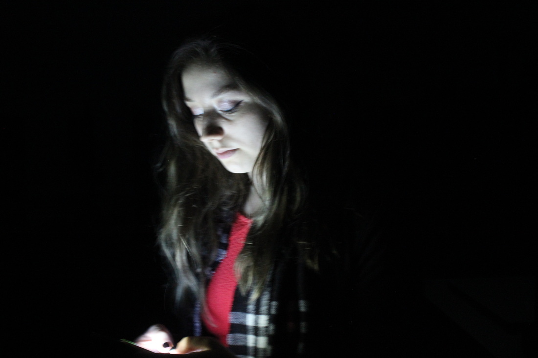
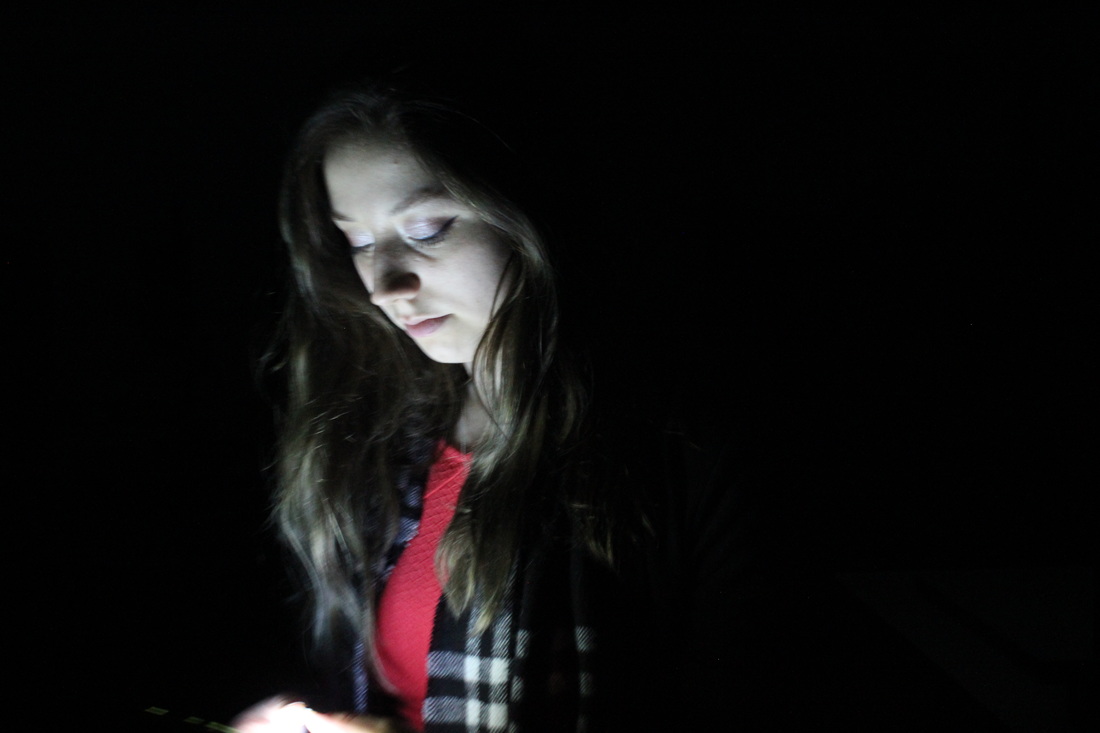
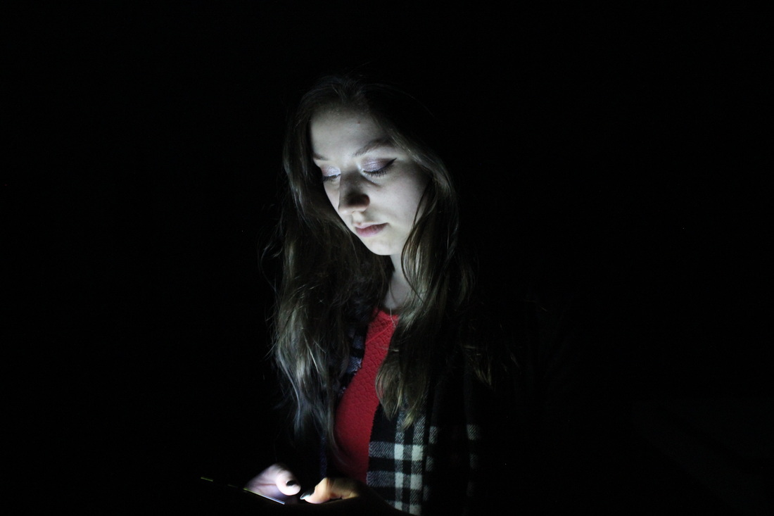
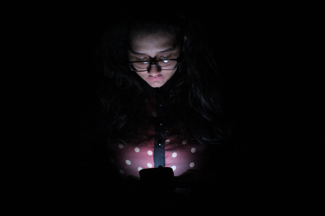
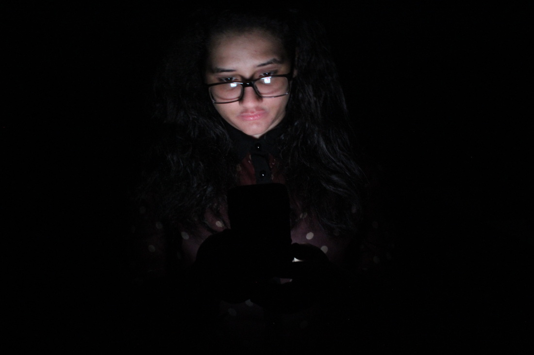
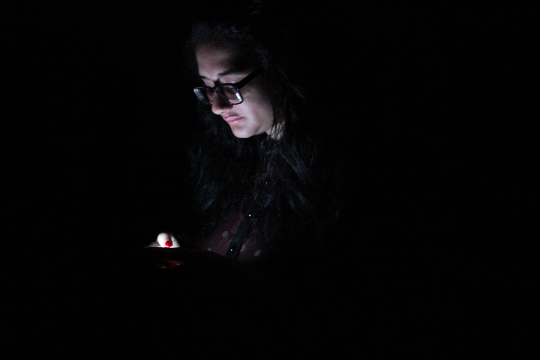
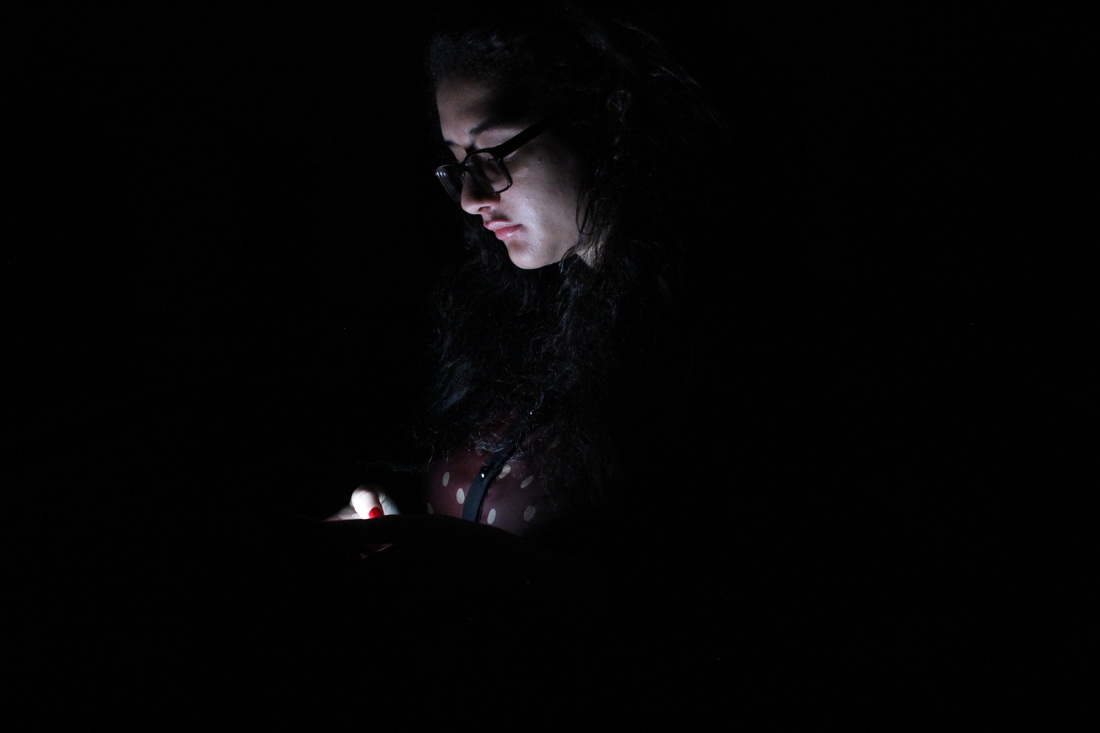
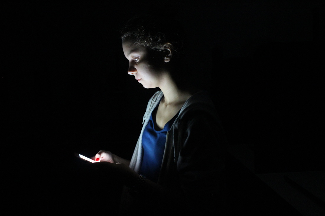
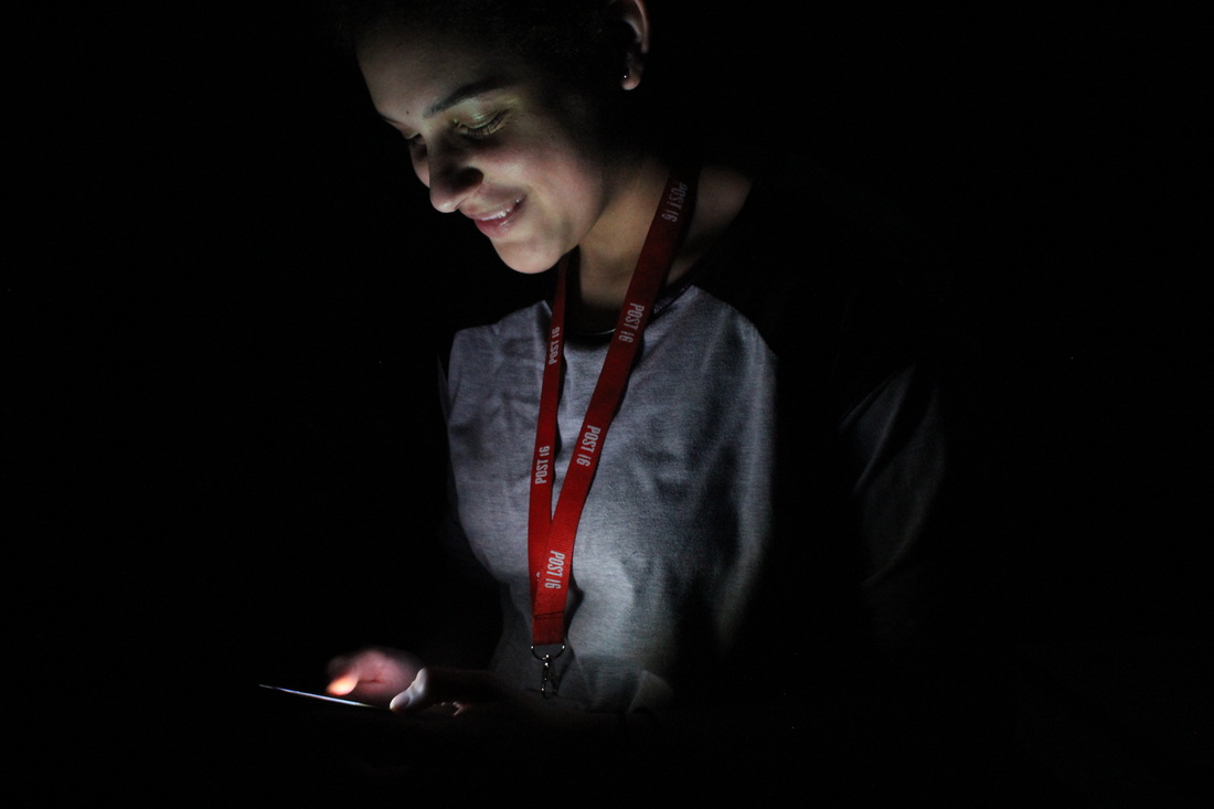
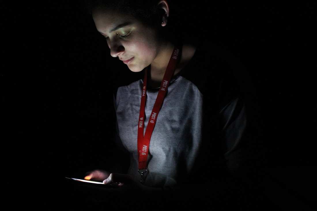
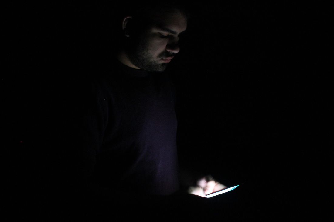
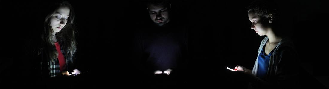
Upon thinking about how to display my images I decided that If I altered the positions of my subjects I could recreate the feeling of being encapsulated by the phone in my presentation. To do this I photographed 3 people facing left, right and centre while looking at their phones which would allow me to display the images like a semi circle hopefully presenting the idea of everyone around us being drawn to their phones as it's such a highly held common possession. During this debate I was also tempted to return to my exploration of surrealism and interest in glitch as I had been unable to fully explore the video side of it previously, I wanted to overlay my image(s) with a looping video in which my centre subject looks up from their phone towards the camera before a slight glitch occurs and they return to their phone, I felt that this would further present the hold our devices have on us as as we remain oblivious to our surroundings.
|
|
|
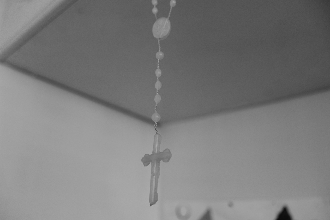
Presented in a triptych fashion both pieces seem to evoke the same sense of religious elevation reinforcing my idea of phones being seen as a deity of sorts. I displayed the image with 3 different people as my final piece while projecting a slightly off centred gif over the middle image, using plexiglass over my images to ensure that the projection was visible. I'm really pleased with how the final product turned out as I feel like it accurately presents my intentions. |
|
|
In Removed a black and white series by Pickersgill our addictive relationship with electrical devices is documented through the absence of technology. In an reenactment of scenes engraved within the mind of Pickersgill he constructs a scene then physically removes the devices sending a humorous yet poignant message to the viewer about our over attachment to the digital world and rejection of reality.
"FAMILY SITTING NEXT TO ME AT ILLIUM CAFÉ IN TROY, NY IS SO DISCONNECTED FROM ONE ANOTHER. NOT MUCH TALKING. FATHER AND TWO DAUGHTERS HAVE THEIR OWN PHONES OUT. MOM DOESN’T HAVE ONE OR CHOOSES TO LEAVE IT PUT AWAY. SHE STARES OUT THE WINDOW, SAD AND ALONE IN THE COMPANY OF HER CLOSEST FAMILY. DAD LOOKS UP EVERY SO OFTEN TO ANNOUNCE SOME OBSCURE PIECE OF INFO HE FOUND ONLINE. TWICE HE GOES ON ABOUT A LARGE FISH THAT WAS CAUGHT. NO ONE REPLIES. I AM SADDENED BY THE USE OF TECHNOLOGY FOR INTERACTION IN EXCHANGE FOR NOT INTERACTING. THIS HAS NEVER HAPPENED BEFORE AND I DOUBT WE HAVE SCRATCHED THE SURFACE OF THE SOCIAL IMPACT OF THIS NEW EXPERIENCE. MOM HAS HER PHONE OUT NOW."
|
Eric Pickersgill |
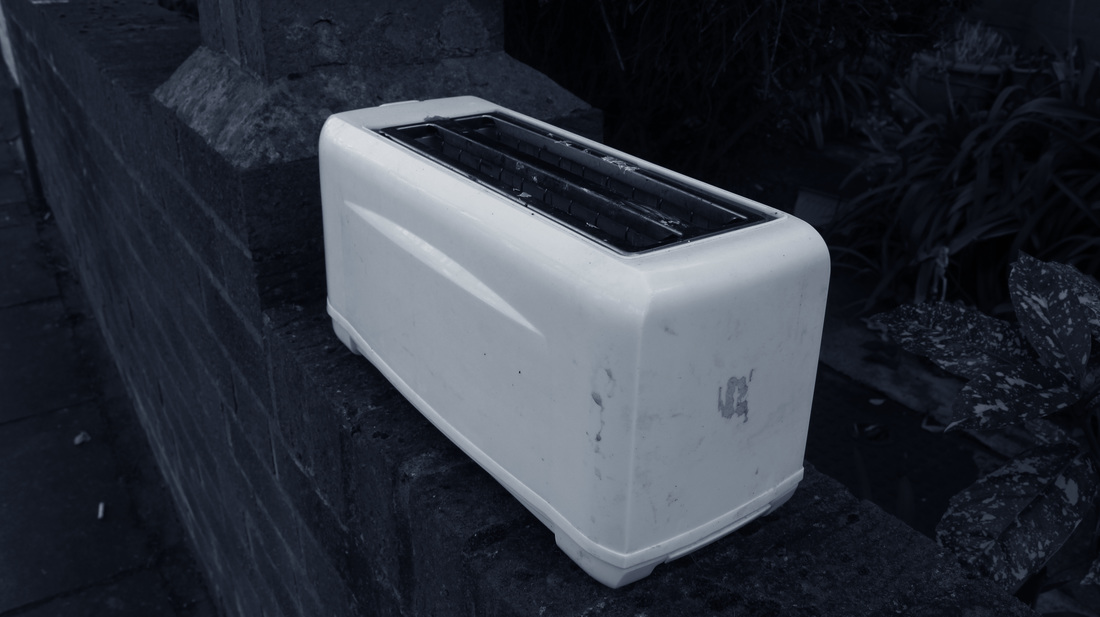
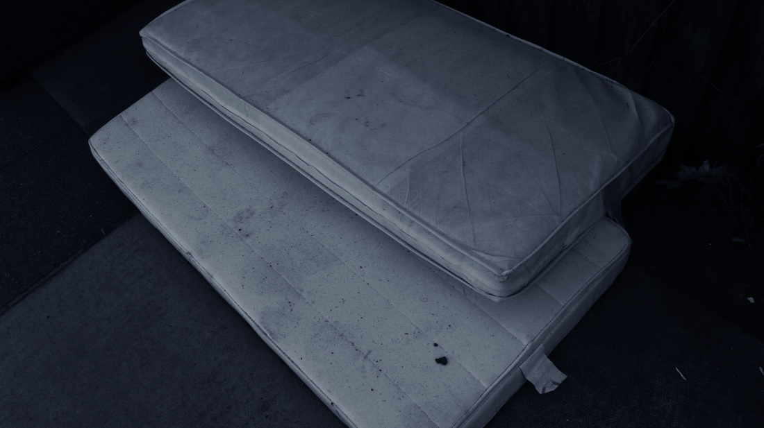
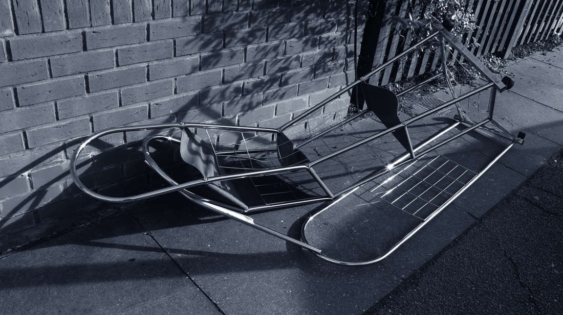
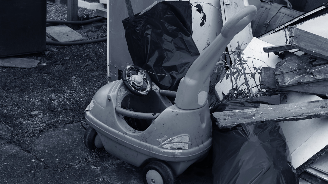
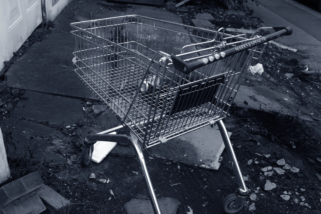
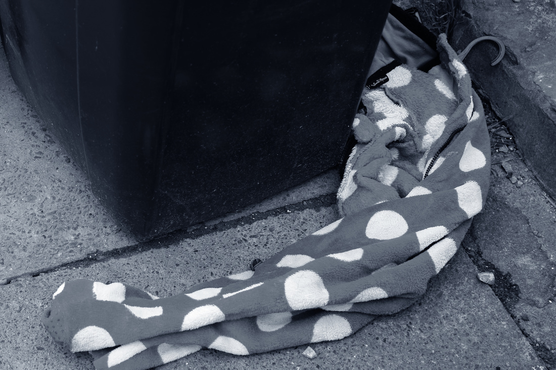
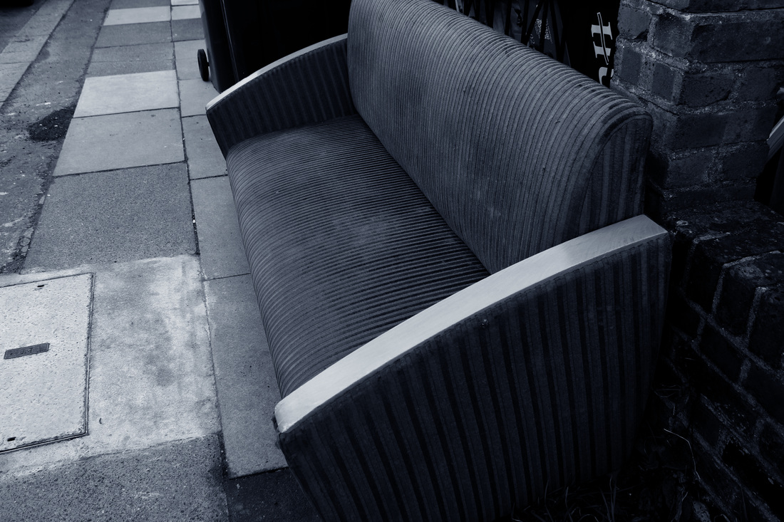
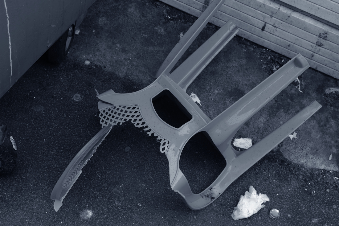
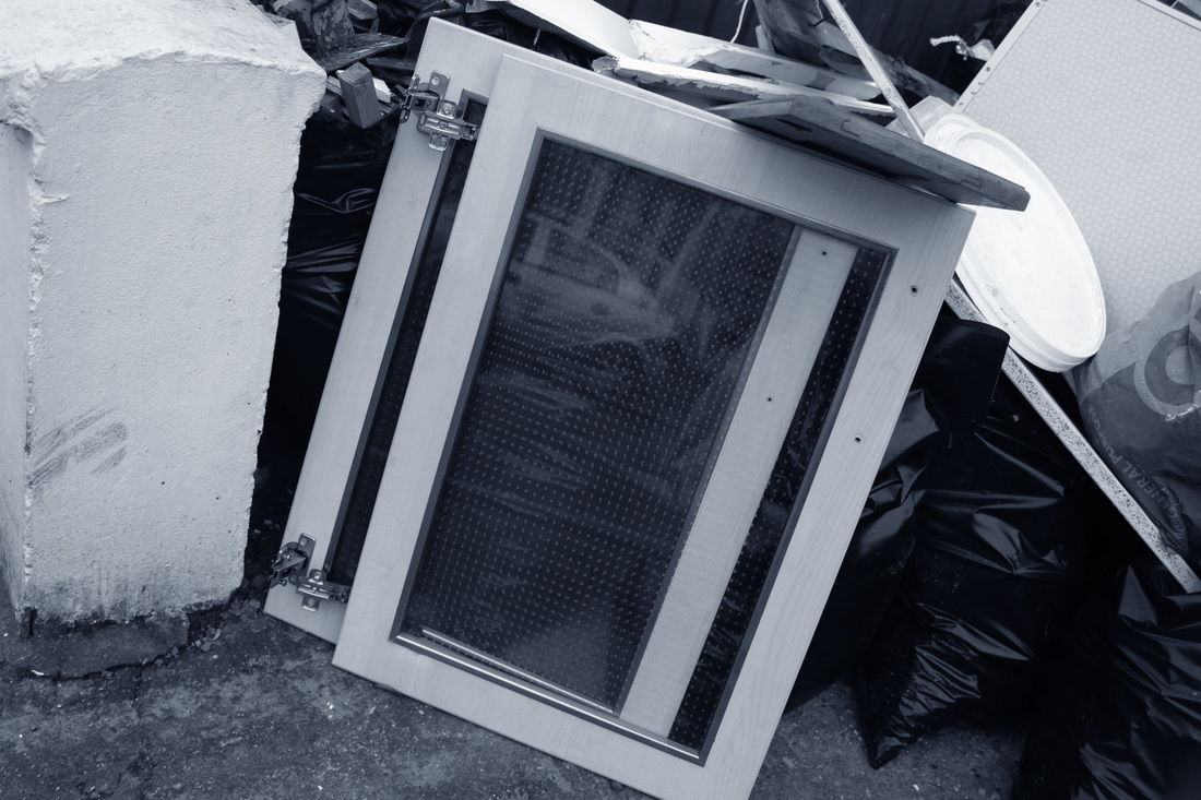
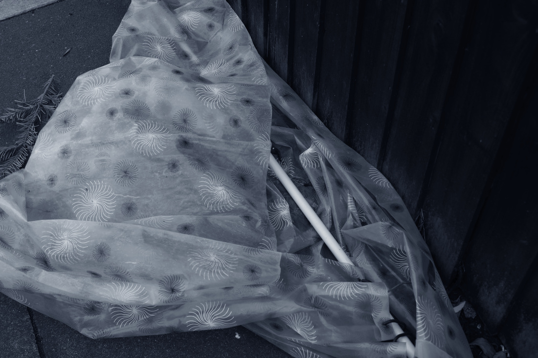
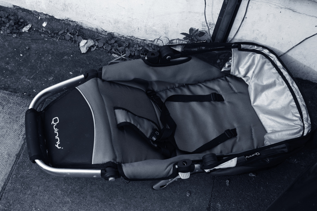
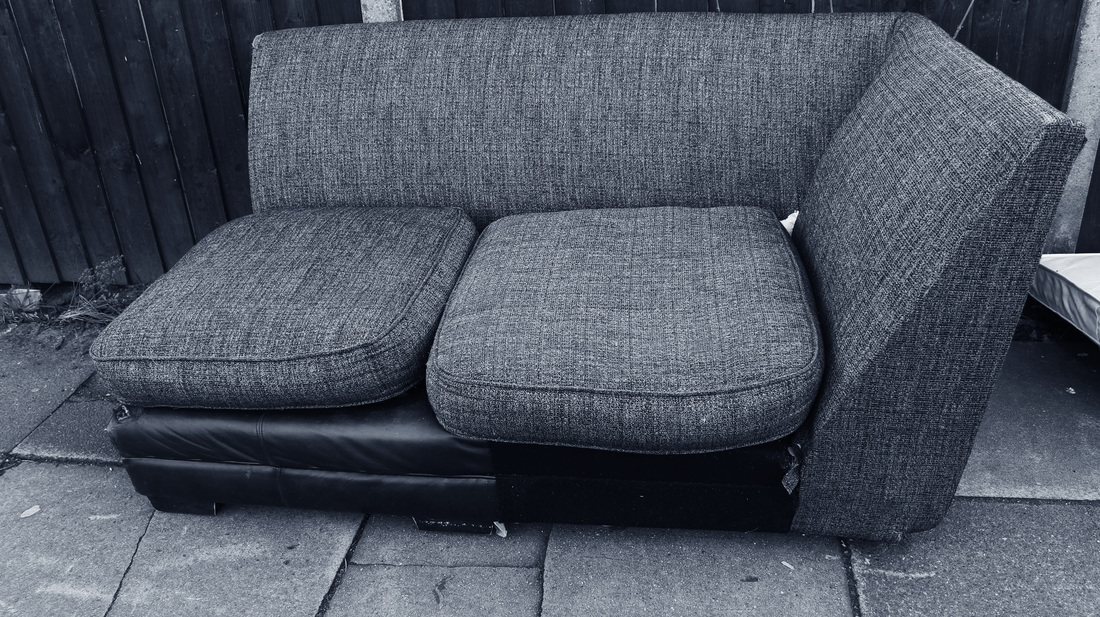
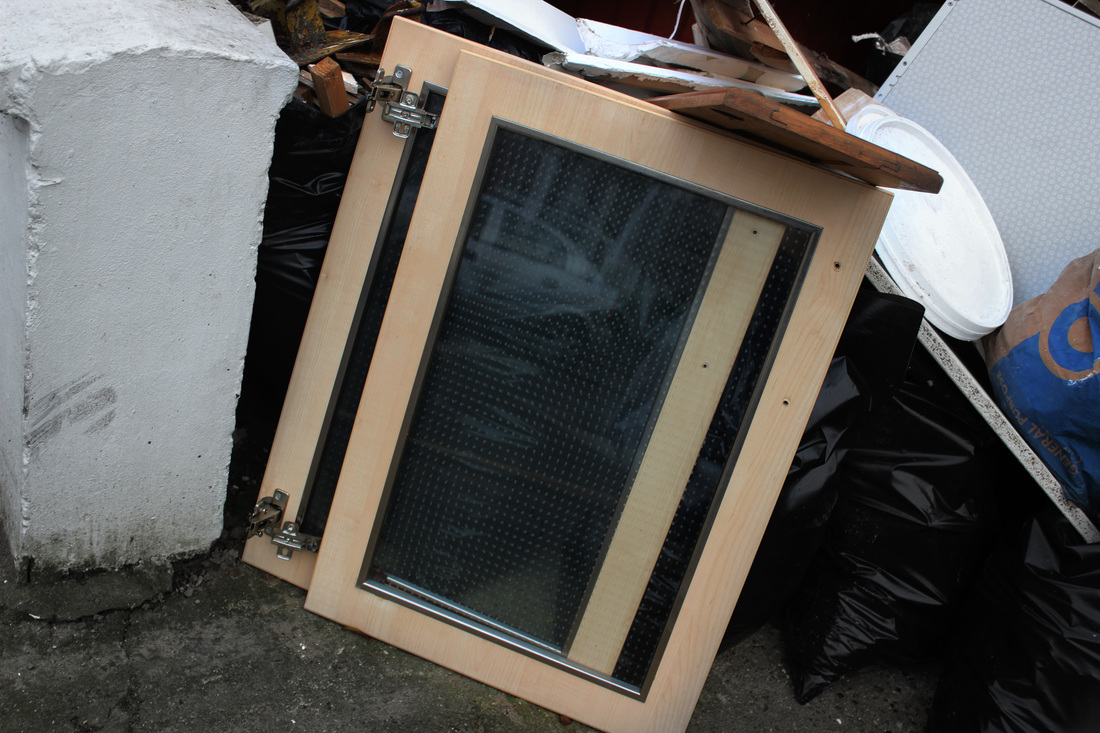
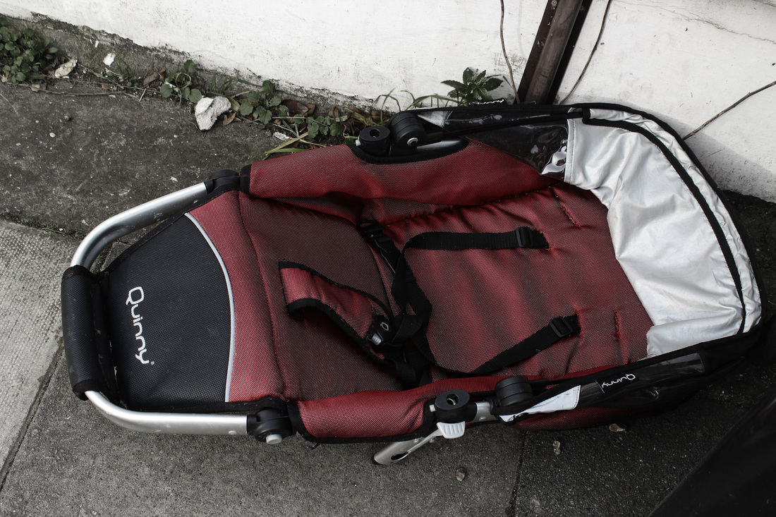
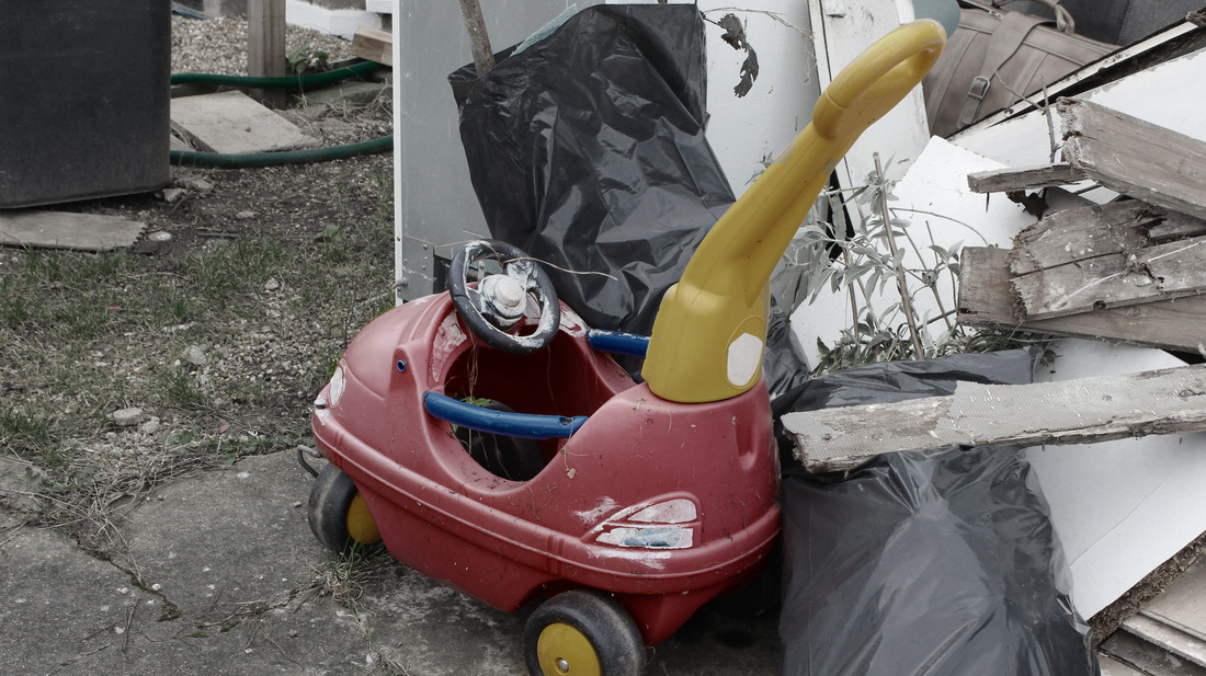
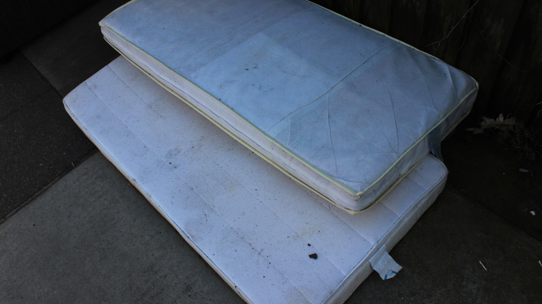
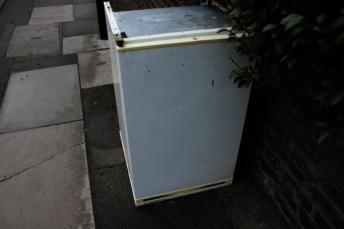
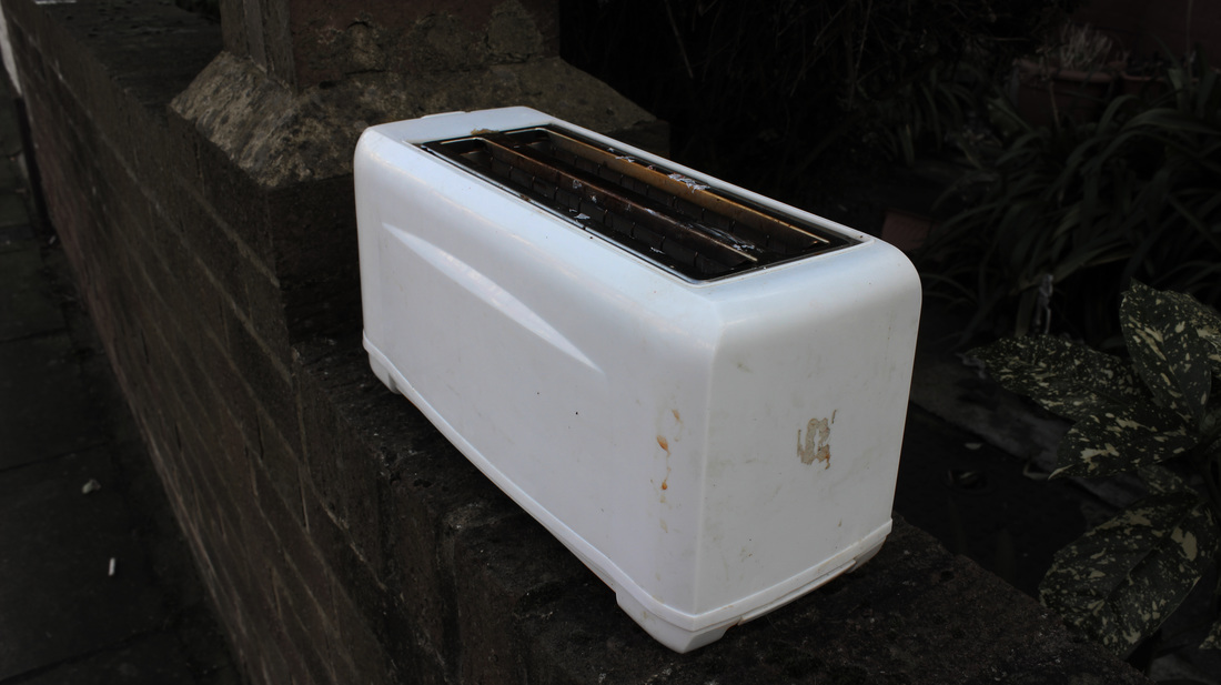
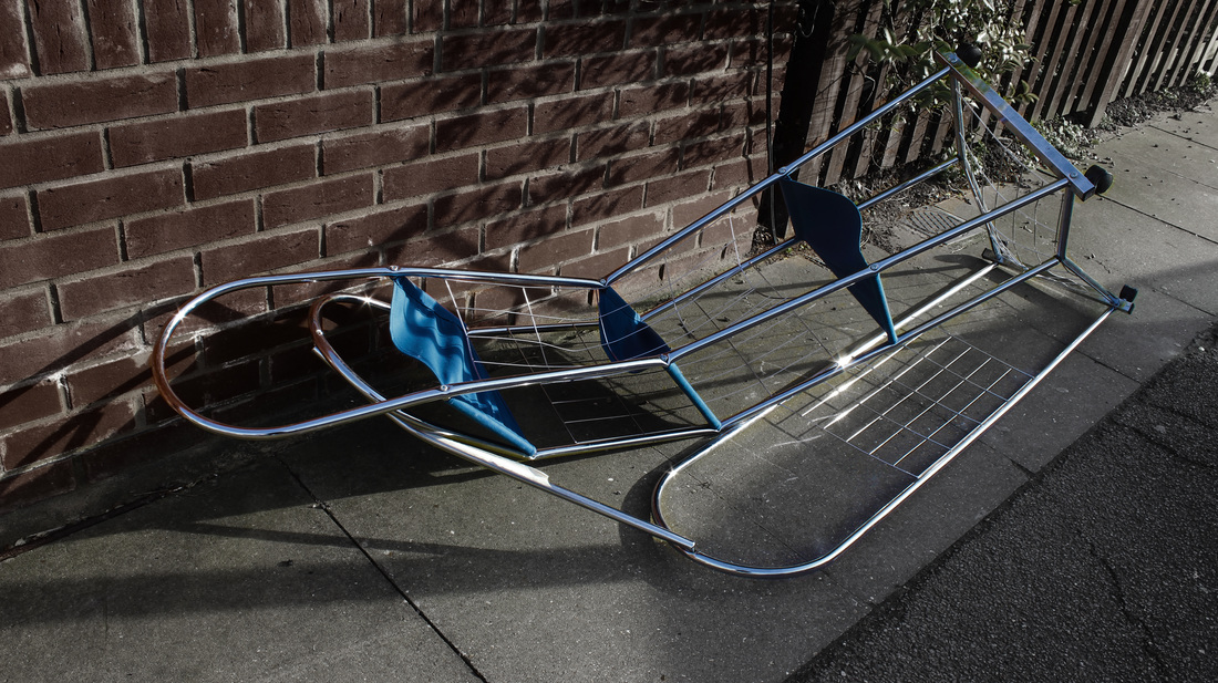
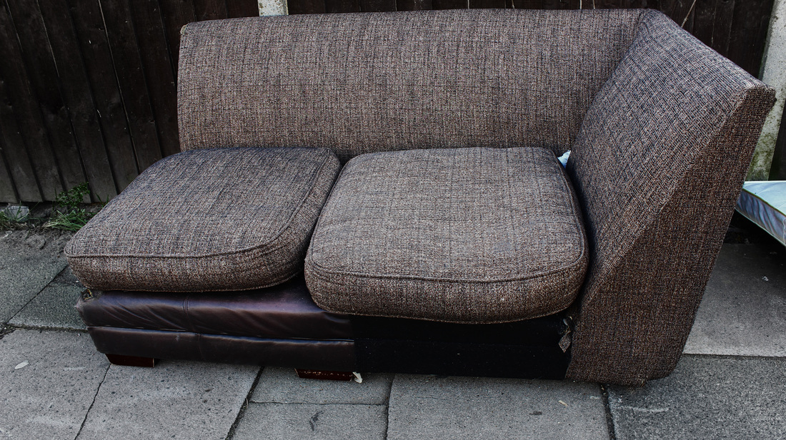
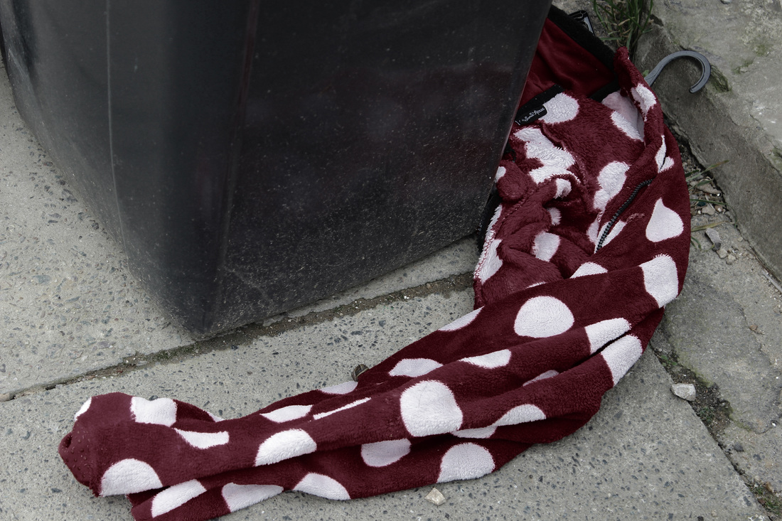
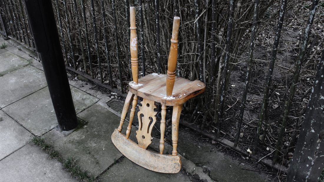
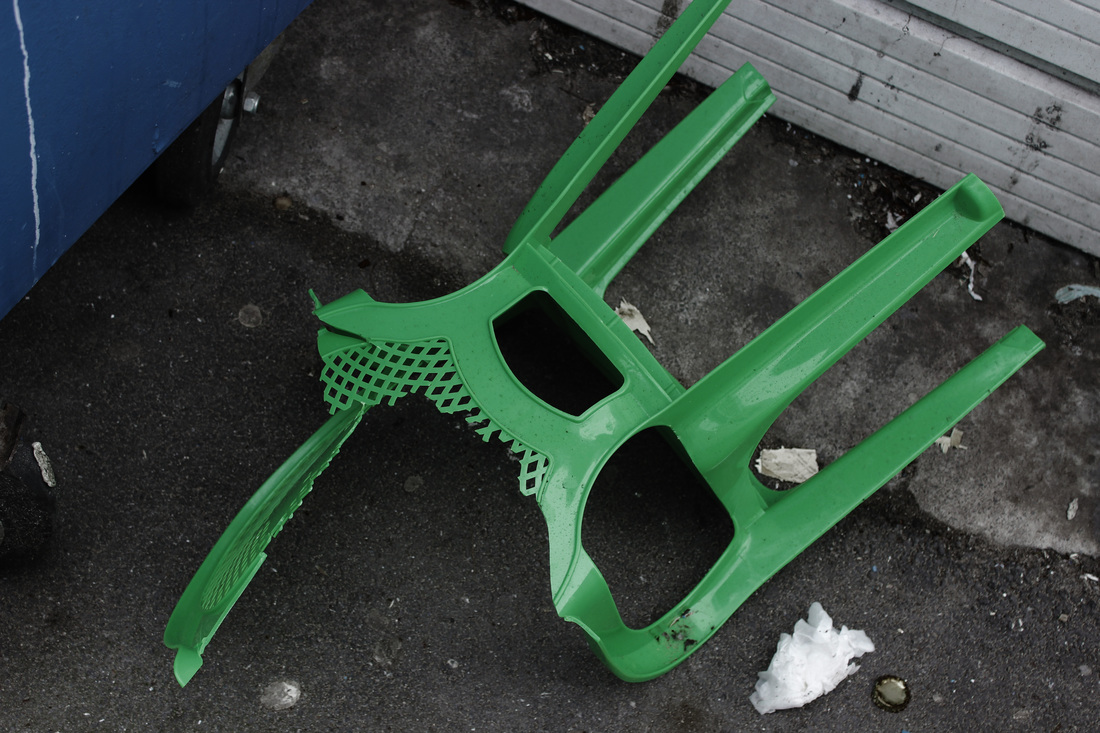
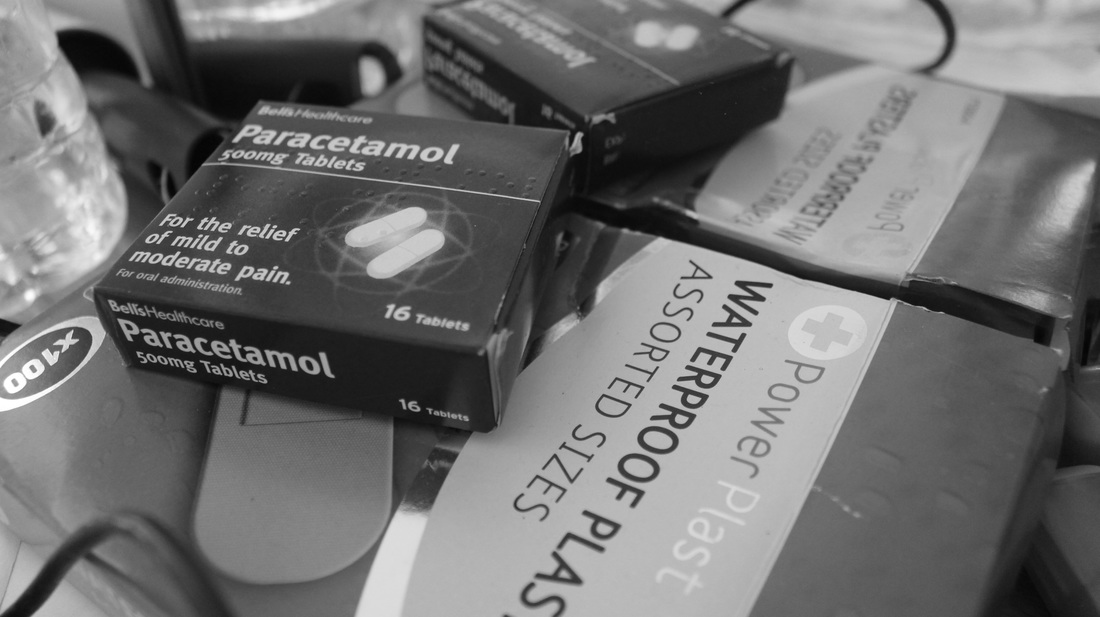
Influenced by Pickersgill and his presentation of our distancing from the real world due to the intense relationship with our electronic devices I decided to look at the disassociation between ourselves and our objects after viewing an expensive looking television disposed of on the street. Each of the images I took sparked the questioning of the events that led up to the discarding of the object as in quite a few situations the items looked as if they were in working order. I focused on only photographing objects of some value rather than items such as crisp packets which would be considered everyday litter. When editing the set of photos I focused on enhancing the contrast between the colours so that the object would stand out, I then decided to add a blue tint to a black and white filter to create a cold appearance and reinforce the negative connotations with the abandonment of objects we had desired at some point during our lives.

|
Due to the absence of backstory for the images I became curious as to why they were discarded so debated between the idea of creating a story in a diary like form or an objective presentation as to why the objects were there. I decided to go with the objective presentation consequently recreating the separation between the object and it's previous owner. Upon visiting the Barbican exhibit- Strange and Familiar, I found myself largely drawn to the work Japanese photographer Akihiko Okamura. While this was initially likely due to his work being one of the few colour sets within the exhibition I found myself heavily intrigued by the subdued colour overlay seen in all of his images as despite this appearance the focus of the images was still apparent due to the slight colour differences,and aided by his tendency to place his subject of focus within the centre of the frame.
|
|
While I couldn't retake my photos with the centring of my subject of focus I could attempt to recreate the colours as i felt it would better suit the distant feeling I was trying to portray through my images. The effect could've been better achieved and consistent throughout through the use of film but I enjoyed that through editing digital my digital images I had a larger control over the final outcome.
|
|
I presented these images within a handmade book,with a parallel objective description of the date and condition in which the object was found. I had initially planned on using a typewriter style serif font to create a formal and objective distance as opposed to a handwritten font which would produce a personal feel but I instead ended up writing the objective descriptions.
Although I believe the handmade feel of the book combated the objective and distant feel I was initially aiming for I thoroughly enjoyed making it as it was a new experience for me which I wish to further explore at a later date. A possibility to offset the subdued objectivity is that I create another book with a lighter colour scheme and display personal items with a loose diary like description, when displayed with my book of discarded items a clear contrast will be shown between the two and consequently fulfil my prior intentions. |
|
|
Zoe Leonard
Zoe Leonard's collaborative series The Fae Richards Photo Archive presents a character through images of them within staged social situations, their relationships with others as well as their possessions. The series of images portray the archived life of an fictional character that the artists felt was underrepresented in history. Leonard is able to present Fae Richards, an African-American, lesbian actress born in the early 20th century through to her old age and involvement in the civil rights movement. Taking into account realistic historical figures and fiction a new character is created to fill a historical void.
|
|
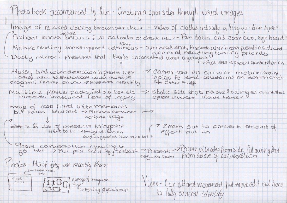
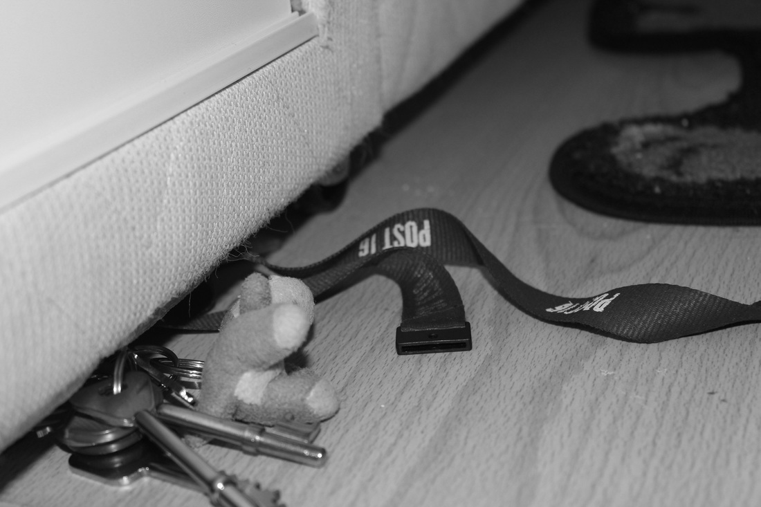
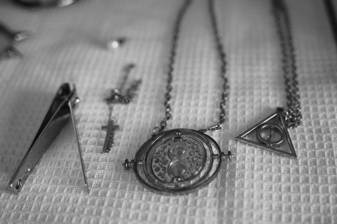
Contrasting Leonard's work I decided to photograph only the possessions of my fictional character removing her physically but leaving traces of her presence. I wanted to present the relationship between ourselves and our possessions and how they are able to mould or define us.
Using a character trait generator I was able to plan how my imaginary character would be portrayed through images as well as film. |
|
|
|
Despite focusing on the traits given to me by the generator I ended up photographing a few more items which I felt could be interpreted in multiple ways and was also unable to photograph other traits in the way I had visualised. I wanted to present these images on a single page in scrapbook style like Leonard with photo corners and a border but I found when experimenting with the composition in photoshop that I preferred the images without the additions due to the clean final appearance. I then printed these black and white images on photo paper and stuck them in the same arrangement onto a larger piece of board to be presented along with my video.
|
|
I feel my final images had similar look to Sophie Calle's The Hotel set in which she photographed artefacts from guests staying at a hotel she worked at and could produce several descriptions about the imaginary person I had created through my images. Due to this I debated with having my viewers respond to these pieces like another one of Calle's works Take care of yourself , in which her viewers created various responses to her work but decided against this in favour of pairing flash cards with my final set upon which the viewers could detail who they felt the character was consequently answering the question posed at the beginning of the video. I feel the audience response will demonstrate how our possessions can be seen to define us as the viewers are able to create a character from a few items.
|
My video consisted of a moving presentation of the images in the set as well as a few more items. To avoid altering the mind of the viewer as they attempt to envision the character created by the images and video I avoided showing any indication of the character's appearance within the video.
|
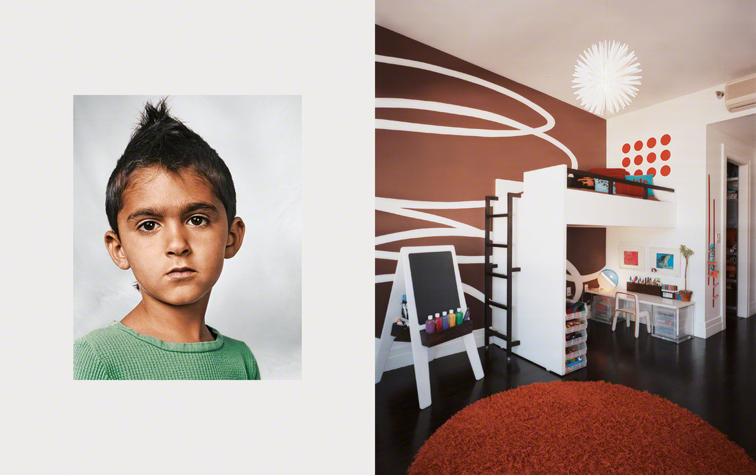
James Mollison
|
James Mollison has created several series in which people are presented parallel to their possessions. What refugees carry with them, Collectors and collections and Where Children Sleep all use diptychs to create a relationship between the individual and their item, even without the additional blurb about the person within the shot we are able to connect with them. I feel this is aided by the clean presentation and portraits.
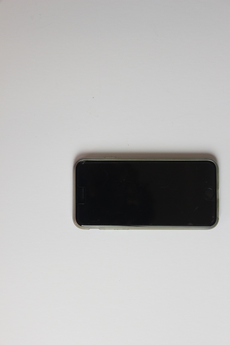
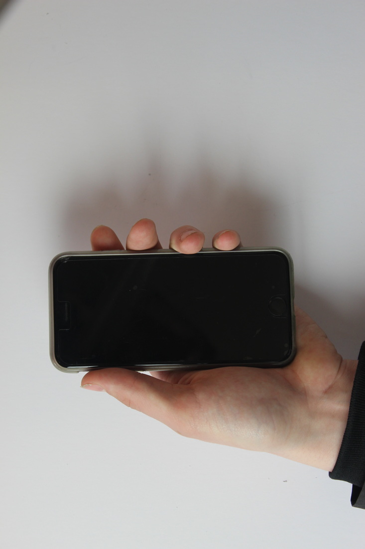
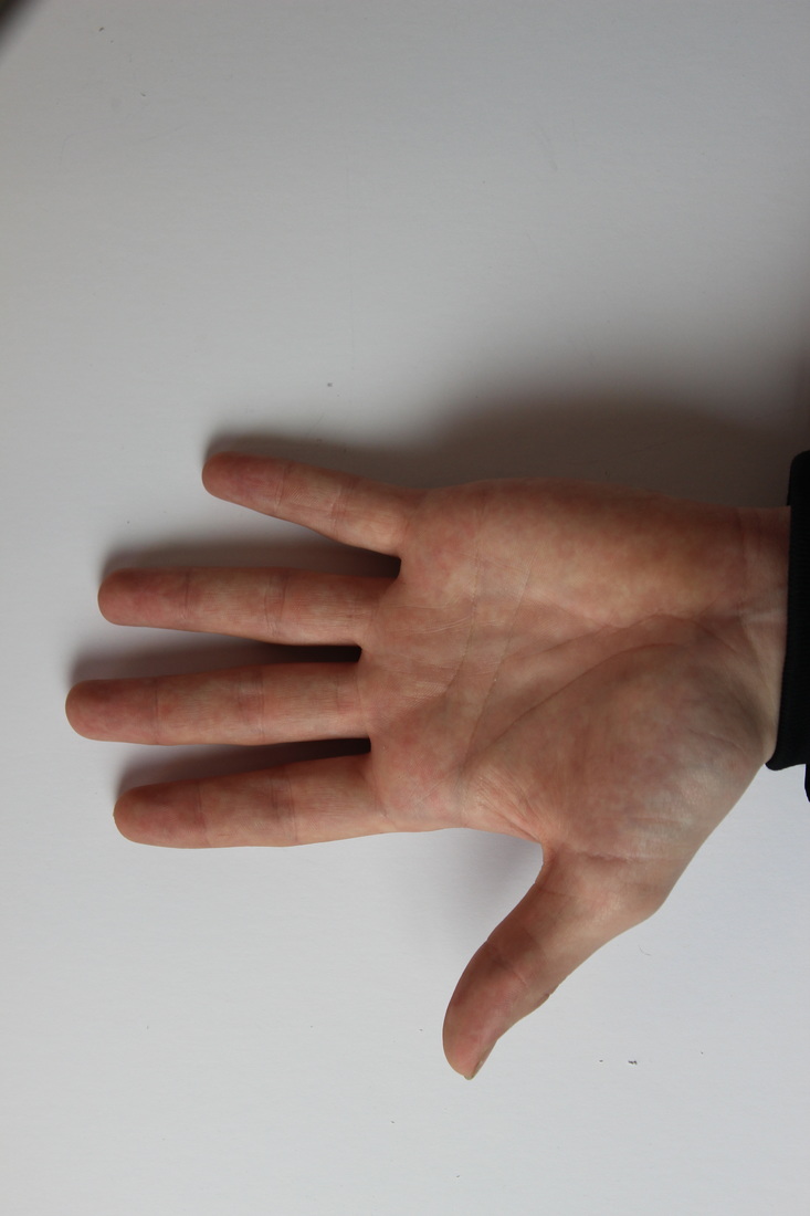
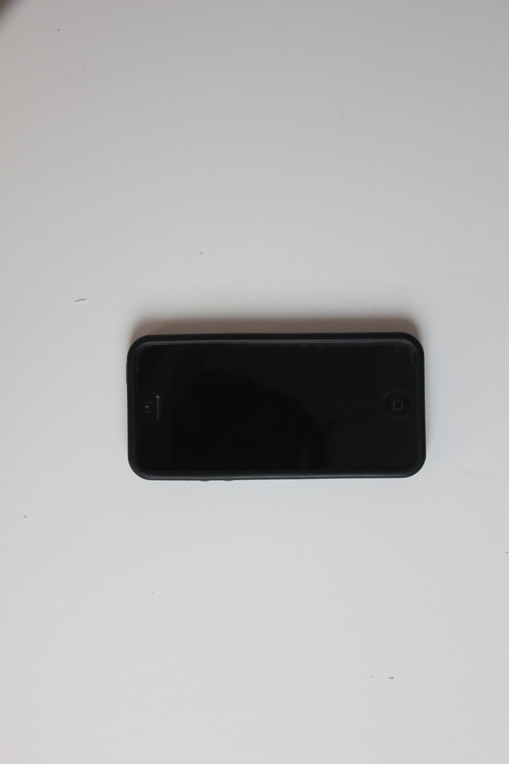
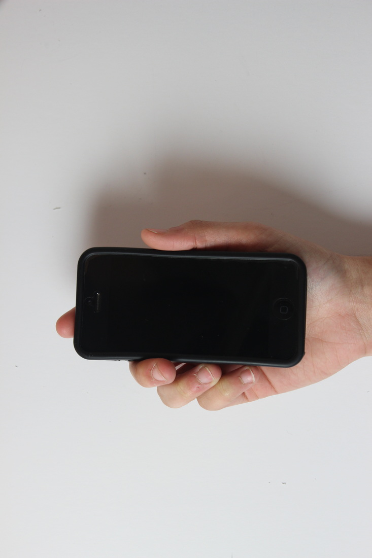
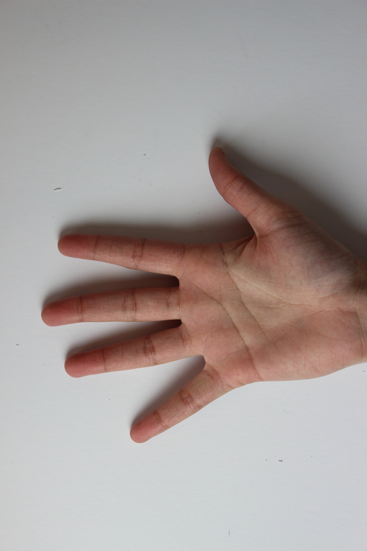
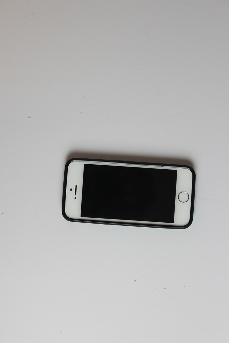
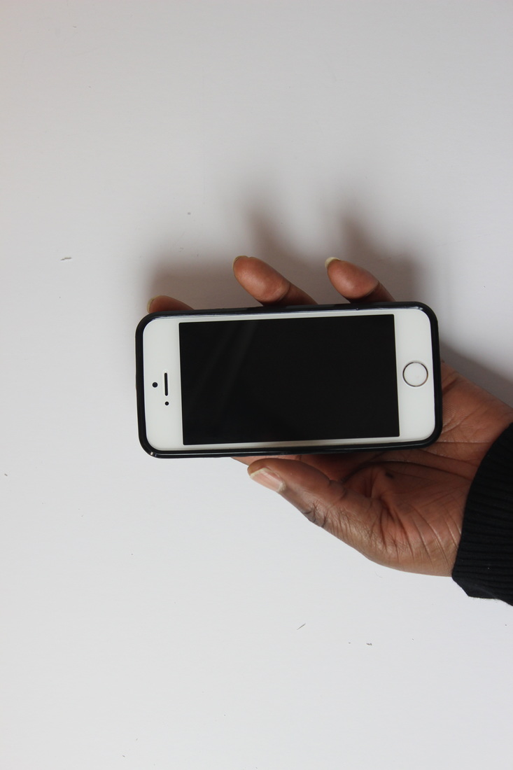
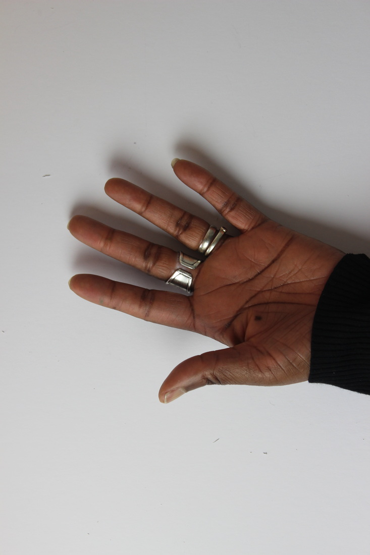
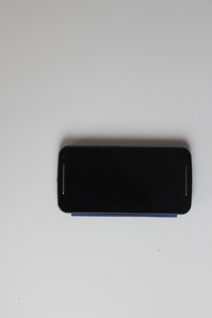
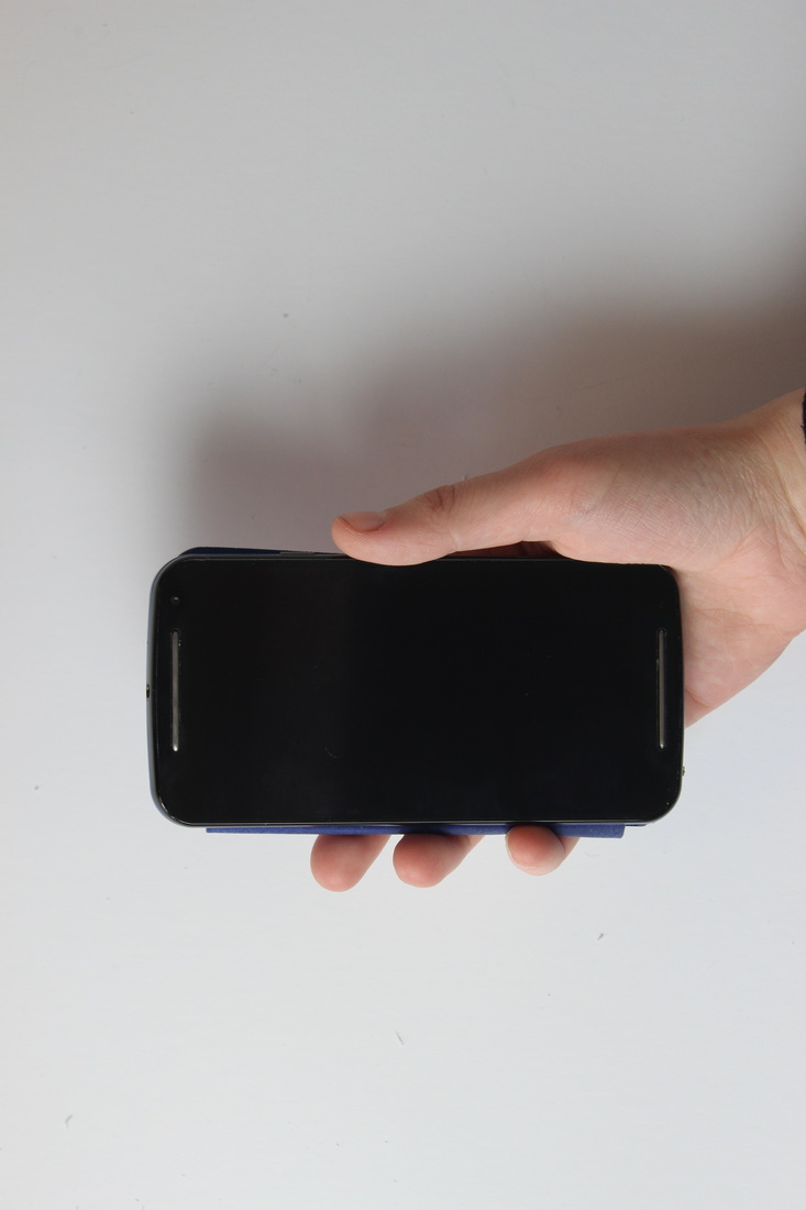
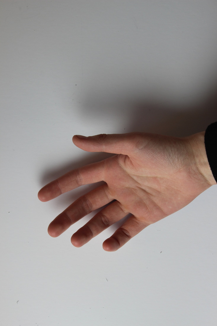
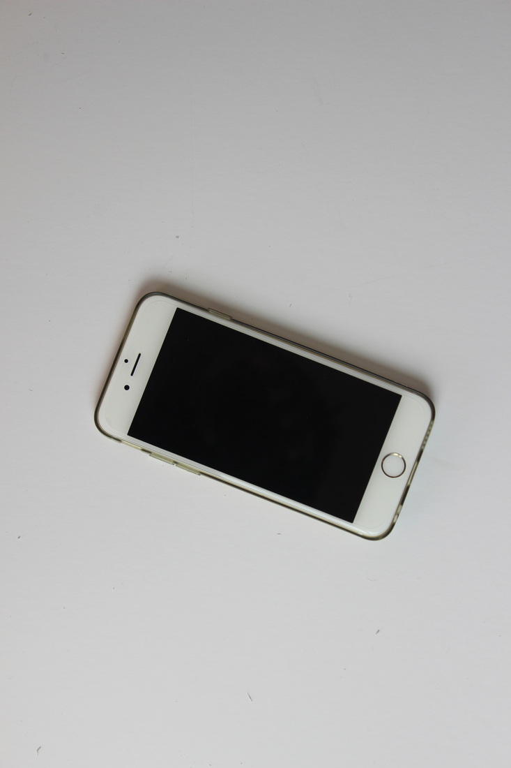
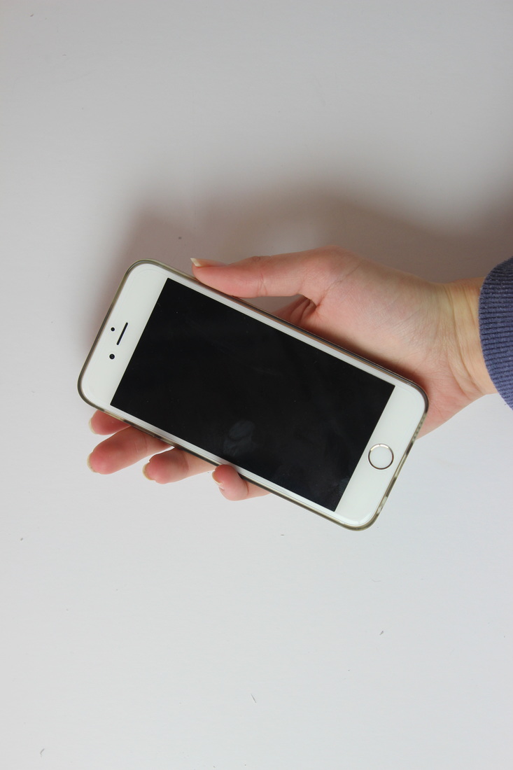
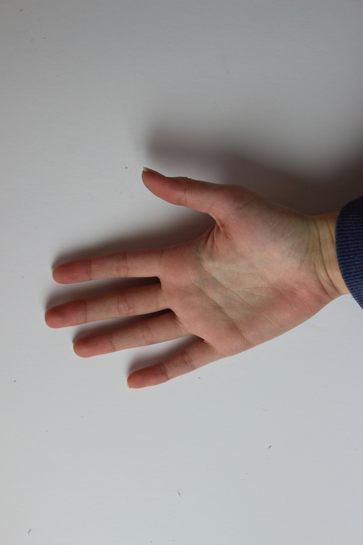
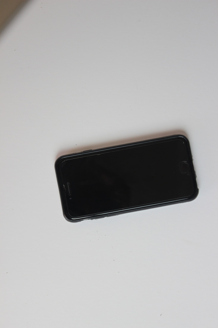
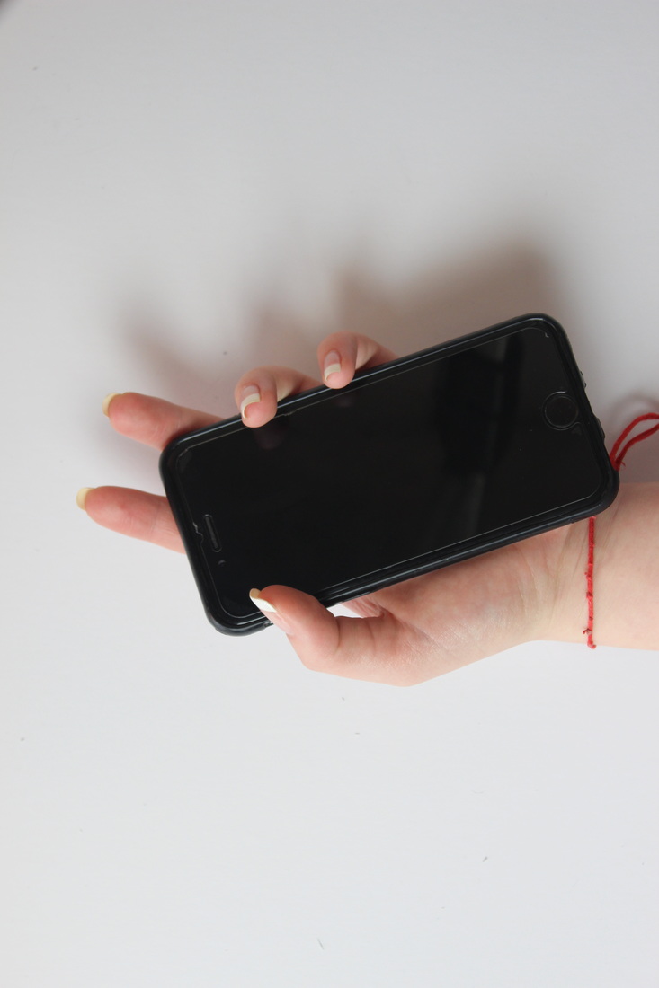
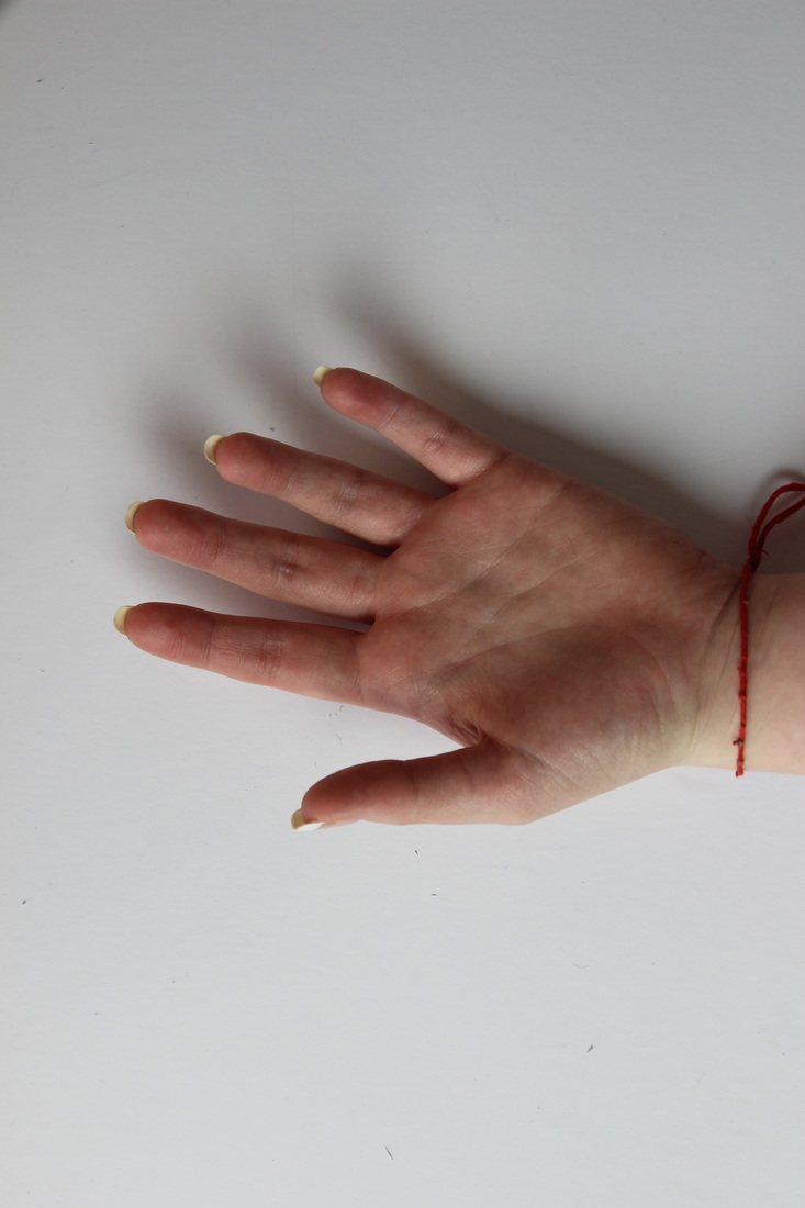
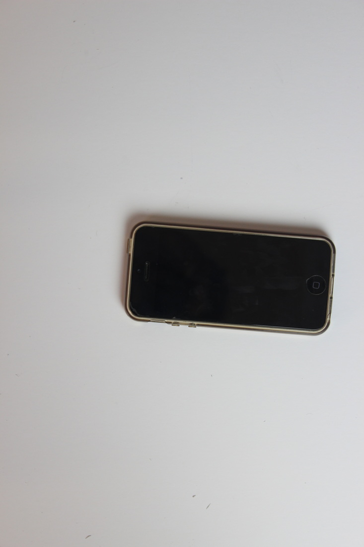
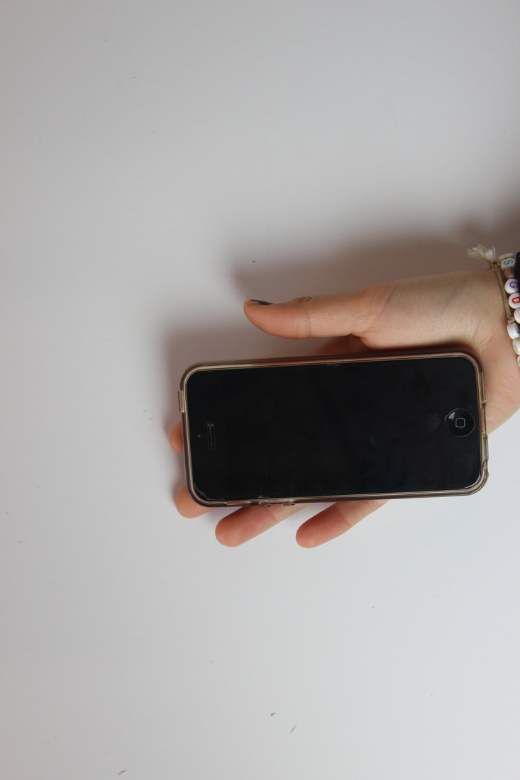
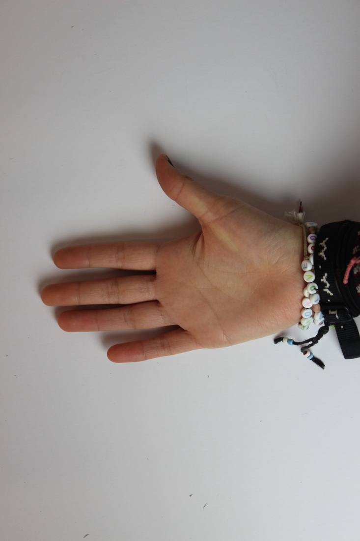
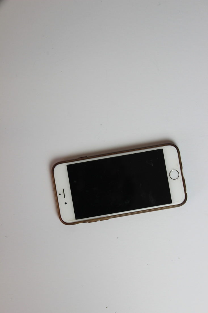
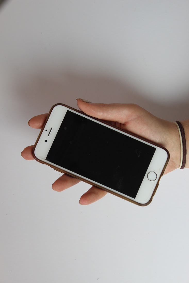
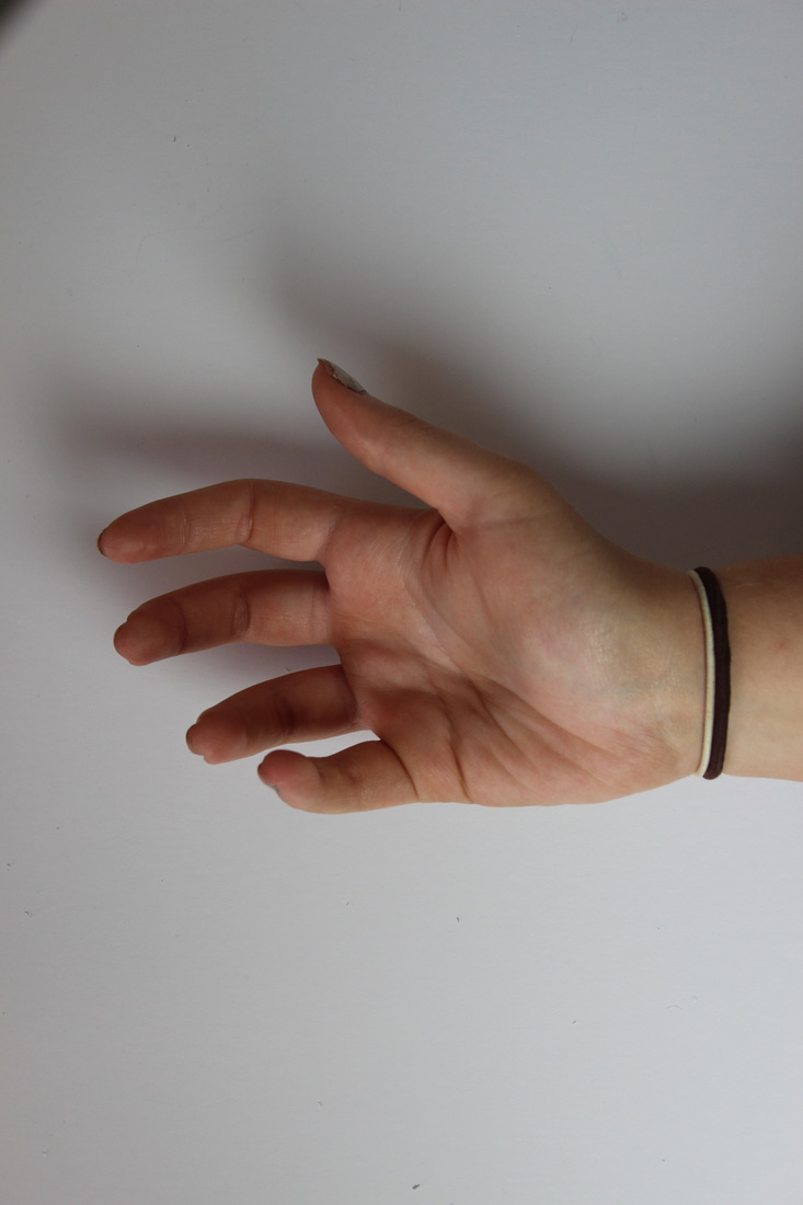
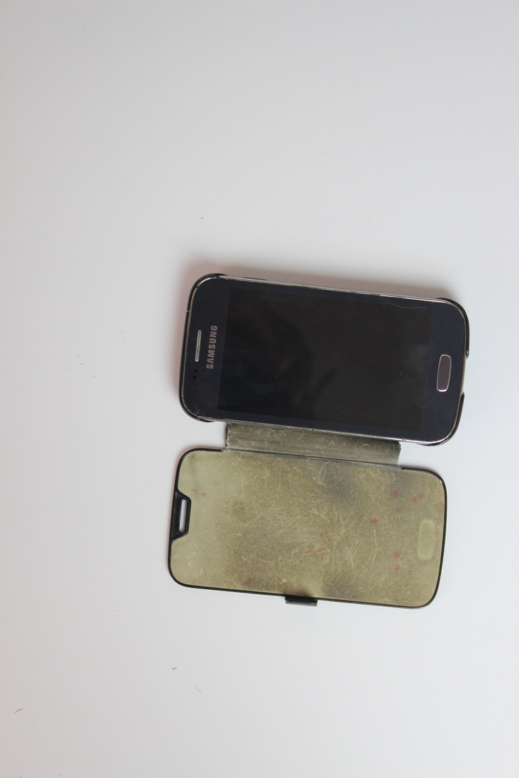
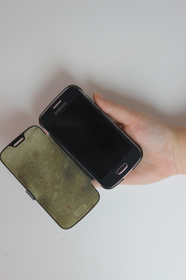
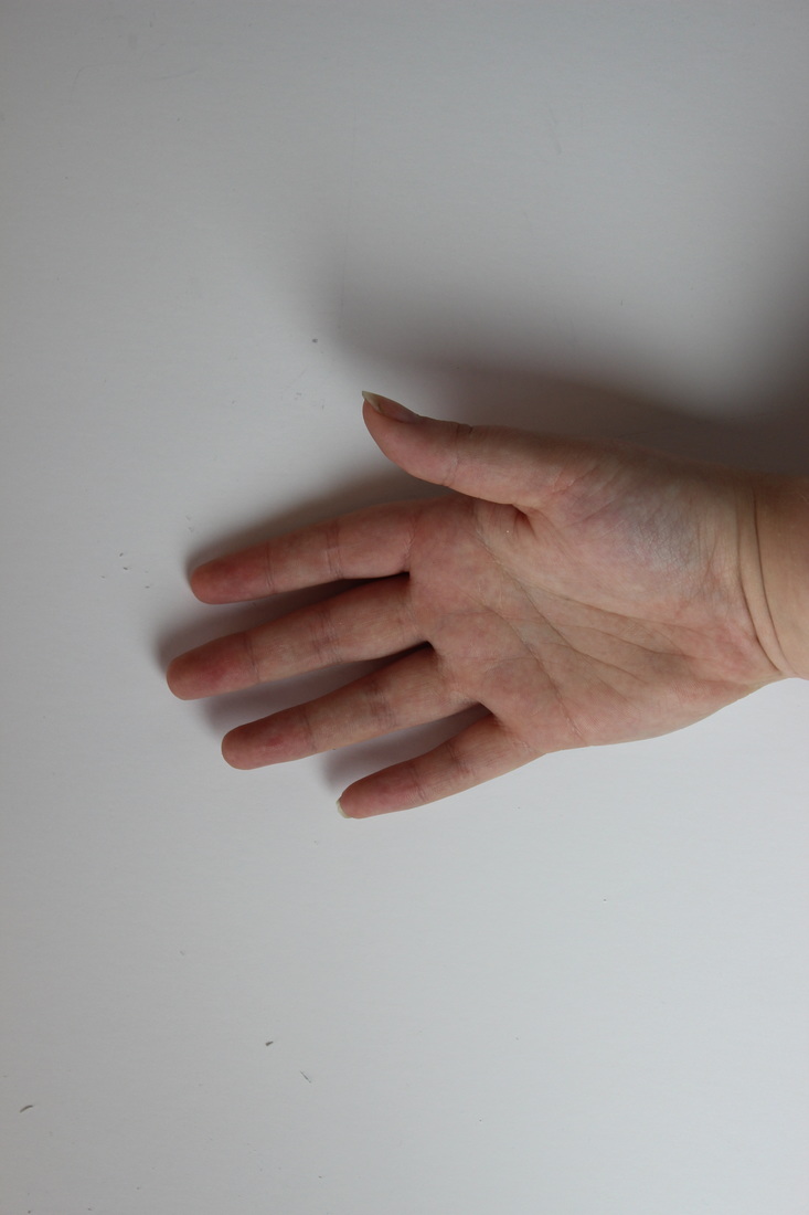
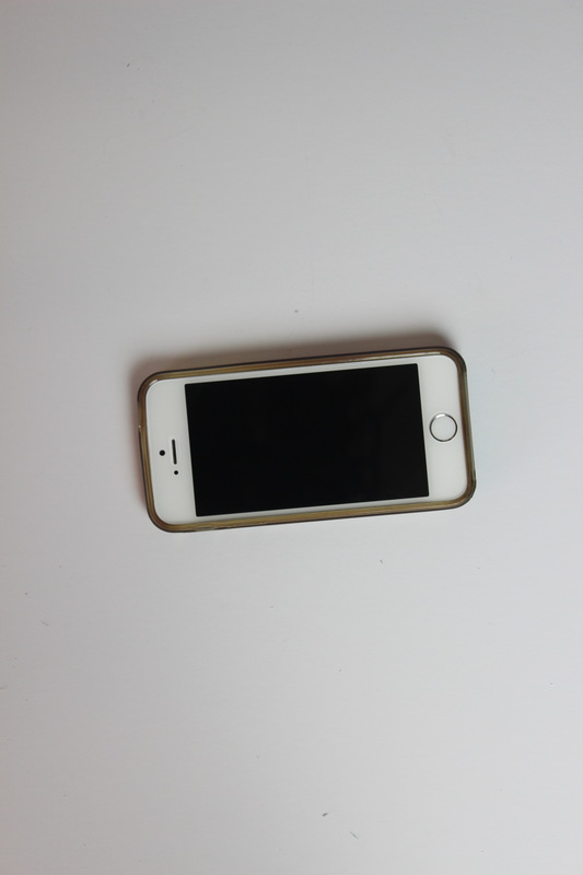
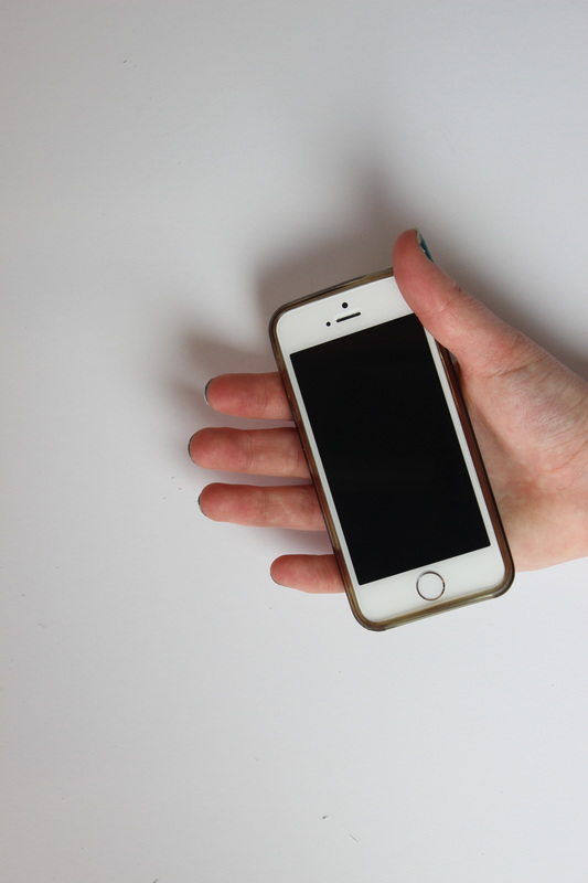
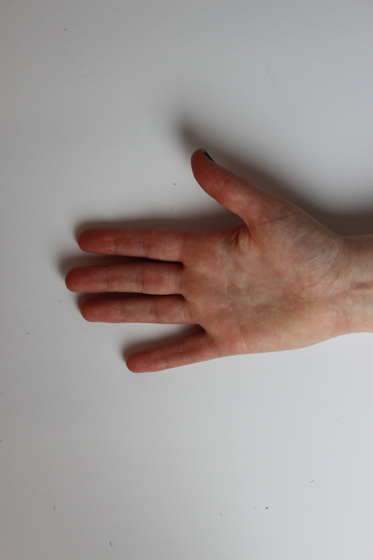
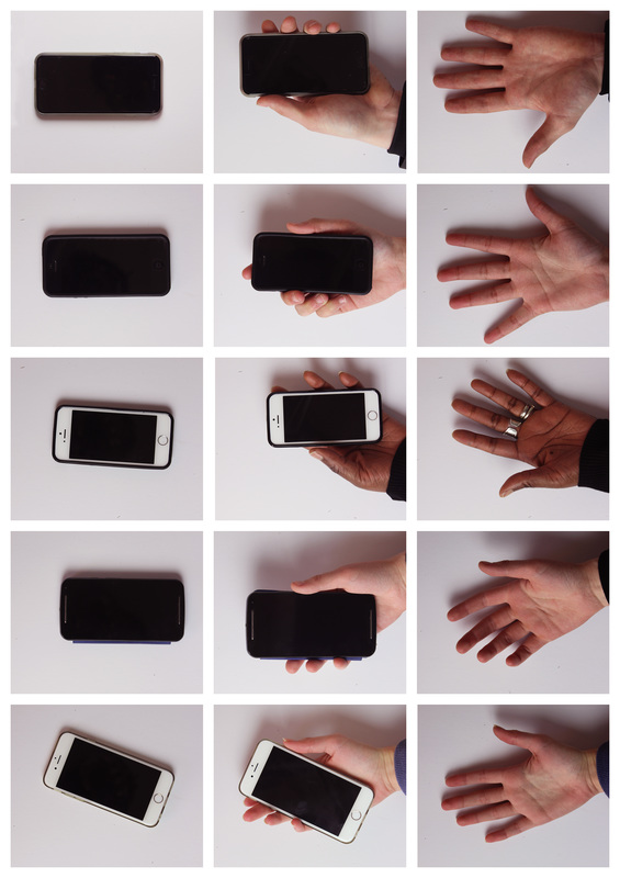
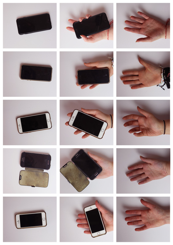
Rather that continuing with the exploration of other objects I decided to return to the relationship between ourselves and our phones as I felt that due to being a universal object it would be easier for the viewer to identify with the idea I'm attempting to portray. I had initially thought of creating a diptych like Mollison with an image of the phone parallel to an image of a hand to express the absence felt without the phones, although while shooting I decided take a series of 3 images instead as I found it intriguing how differently people held their phones. |
|
|
I then presented these images in a typology as it allows to see the differentiation in how people hold their phones, from looking at my images I point out those who are more attached to the device and usually have it on their person due to the relaxed position and those who don't have as close of a relationship by the rigid almost foreign grip. Through increasing the contrast and adding a slight pink tint I achieved the look I had envisioned, I felt the pink tint created a slightly delicate appearance which I felt amplified the bareness of the hands in the final image. I also could've recreated my images of people holding their phones in the dark room then have an interactive presentation in which they select which image they feel is theirs which may demonstrate that those who correctly identify their images are able to do so due to the action being natural to them
|
I'm quite pleased with all of my outcomes but if I had more time I would further work on my video response to Leonard as I wanted to further explore movement without revealing the character's appearance. Despite not fully straying from the relationship between people and phones I feel I could still further explore the topic as I had ideas to photograph where we place our phones which could be seen as a continuation from my typology as it also deals with our distance from the device, I also wanted to create somewhat of a satirical collage piece in which I take an image of people on their phone and superimpose them into unusual settings almost as a reverse of Pickersgill's Removed series. Another idea dealing with phones I was tempted to tackle was how we use them in inappropriate or uncomfortable situations as an escape, I wanted to present this through placing images of environments in which we would usually refrain from using our phones and editing them into a social media layout to present our addiction (i.e a picture of a funeral with a snapchat geofilter overlaid) although felt this would stray more into social issues rather than the relationship between ourselves and our possessions. I feel I returned to the topic of phones as I have a lot to say about the topic due to being surrounded by a generation largely interested in technology although I would also like to expand upon my Discarded series by creating a set exploring items we keep close at all times or nostalgic items we most likely should've discarded but haven't due to sentimental attachment.
