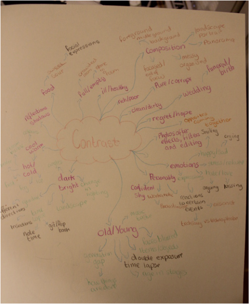
I see contrast as being a clear difference between two subjects, I produced a brainstorm presenting my ideas about this as well as how they could be exhibited.
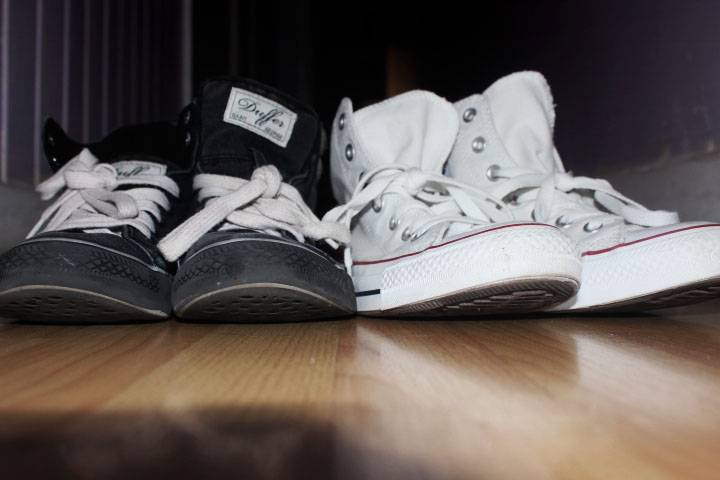
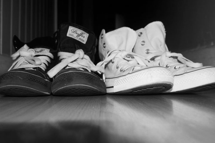
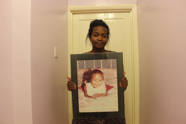
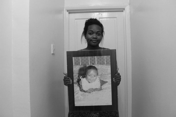
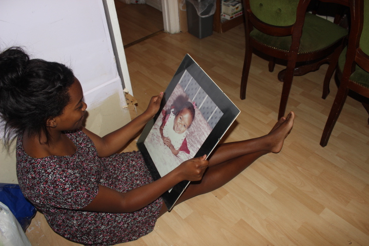
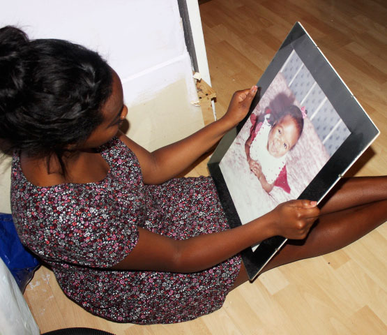
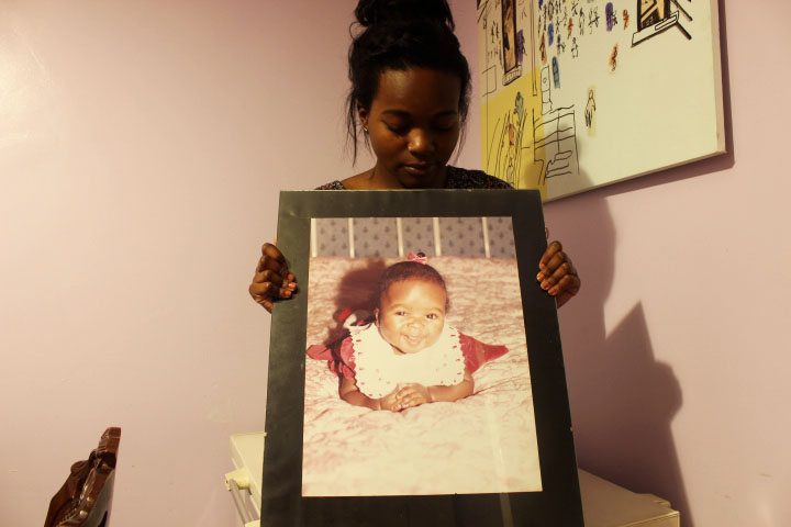
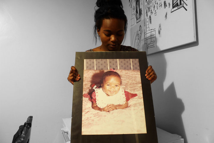
We were asked to select a sub heading and present it through a series of images, below shows my original photos as well as the edited versions even if it was only a slight adjustment in brightness so that there was a significant contrast between colours resulting in them no longer appearing washed out.
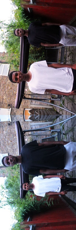
|
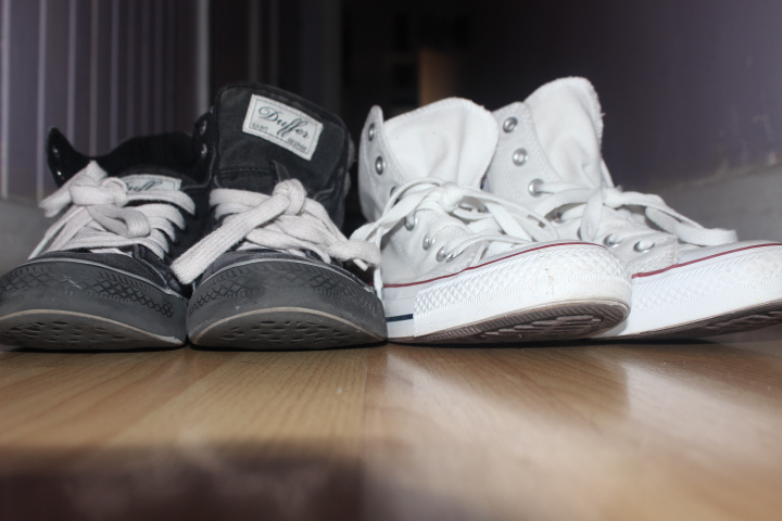
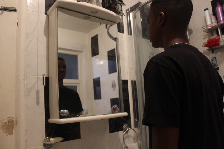
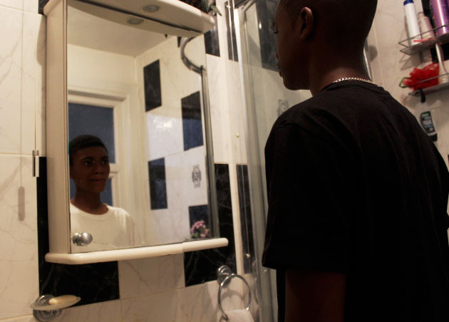
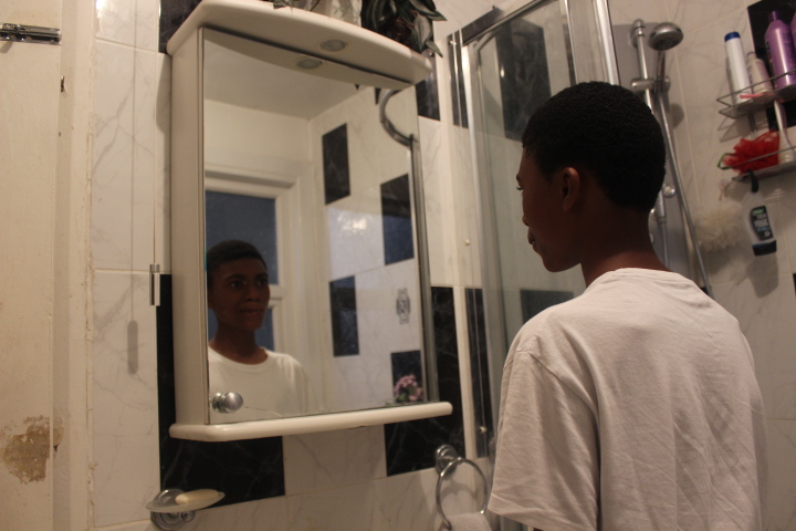
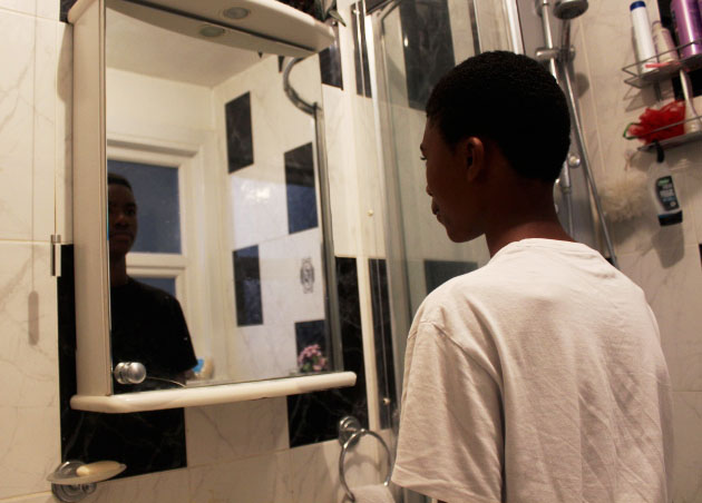
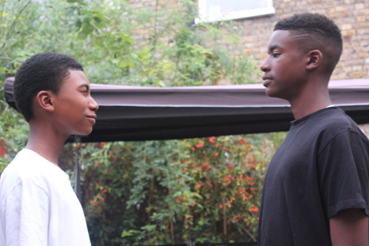
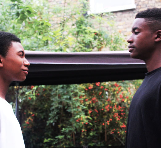
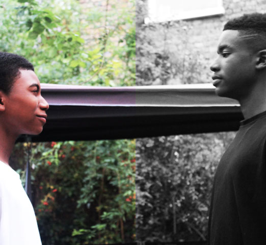
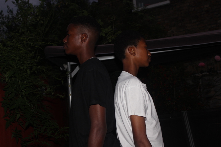
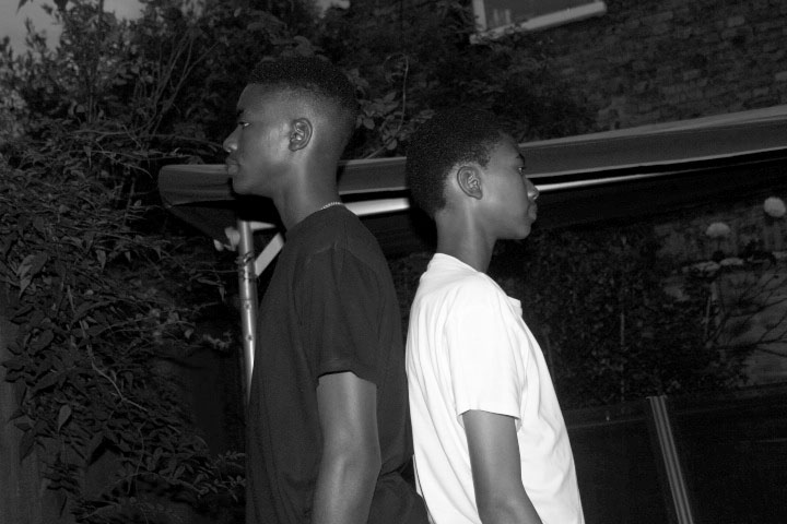
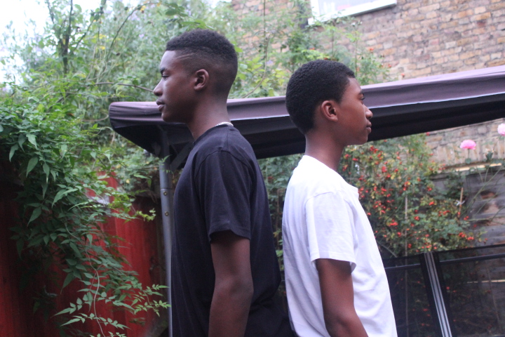
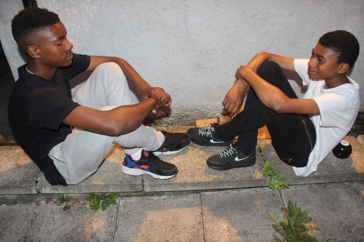
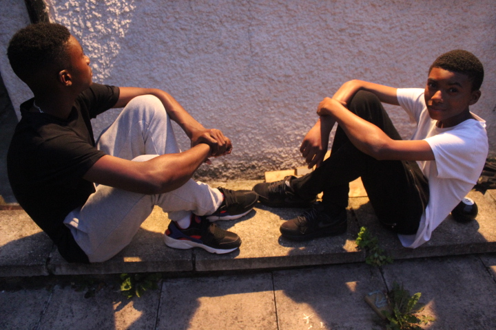
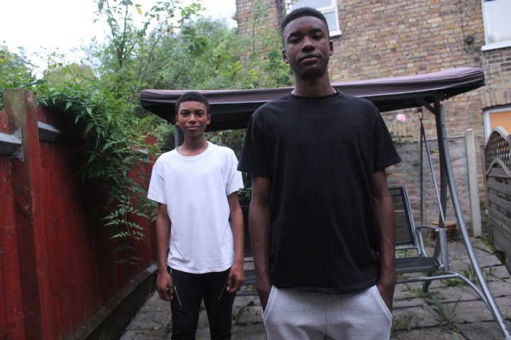
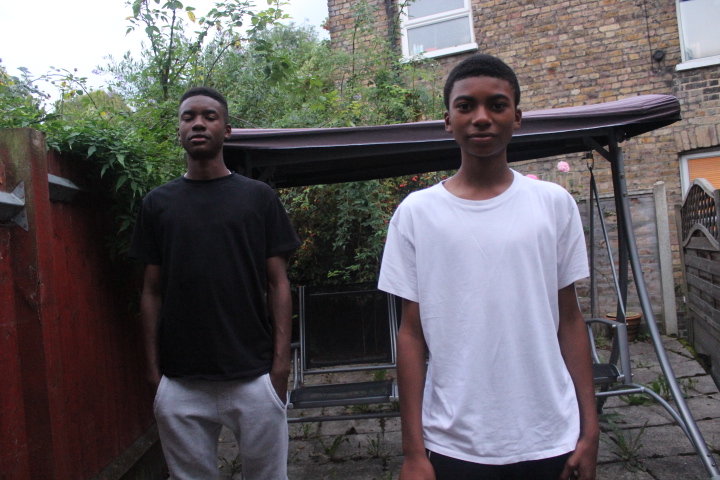
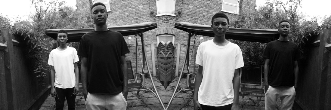
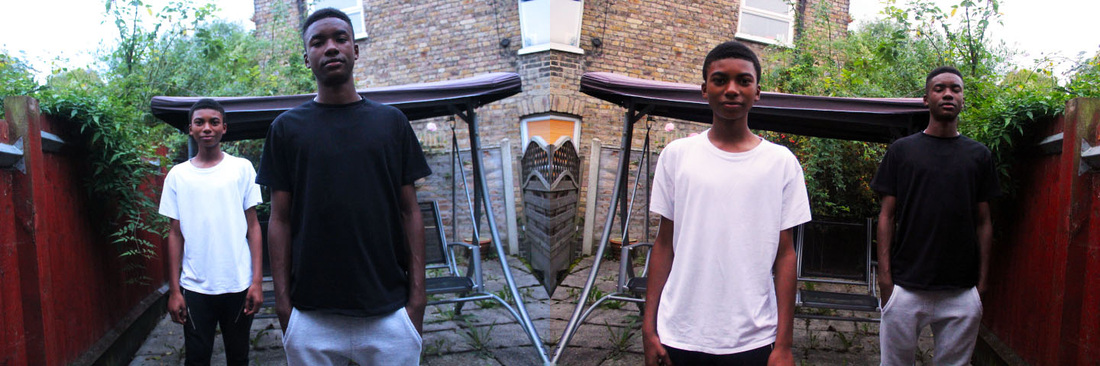
I chose to take my pictures around the category 'age' so that I could present the contrast between different age groups. This is one of my favourite photos edited from this set, I took two images of my cousins and placed them side by side before editing. I made sure to flip the images so that I could line up the centres and so that the younger child would not be next to himself. I asked the younger child to wear white and the older to wear black to signify innocence while young and being exposed to the harsh realities of life when older, I also requested that the teen looked uninterested while the younger smiled and looked significantly happier. In the Image where the teen is in front I chose to make the image appear colder by adding a blue tint with an overlay, for the other image I increased the saturation and adjusted the curves layer to make the image brighter. I feel overall this accurately shows contrast between young and old even if there isn't a giant age gap between the two. I feel that I could improve this set by having a larger age gap between the models and showing the different ways they interacted with objects such as new technology, also by using inanimate objects and other body parts such as hands to increase my variety of images. |
|
Antonyms
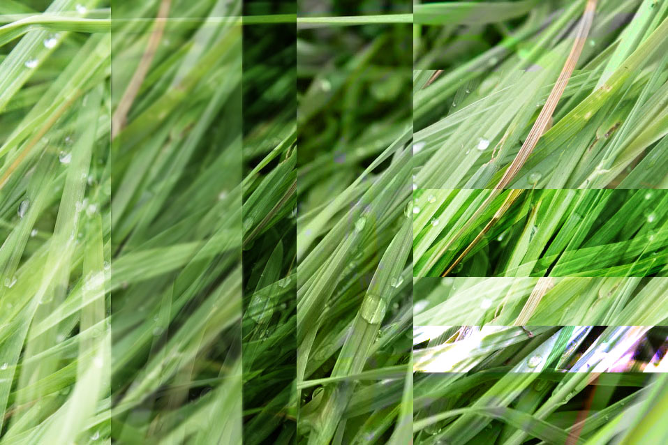
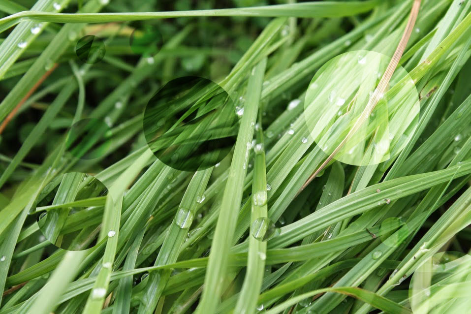
I then edited photos I had previously taken in order to present a contrast. I split up an image of grass into multiple sections, moved them around the image and adjusted the blend modes, I felt that the harsh lines of the rectangle somewhat contrasted the soft grass. I repeated this effect with circles instead of rectangles although I felt this wasn't as effective due to the smooth curve which I felt dimmed the contrast I was aiming for.